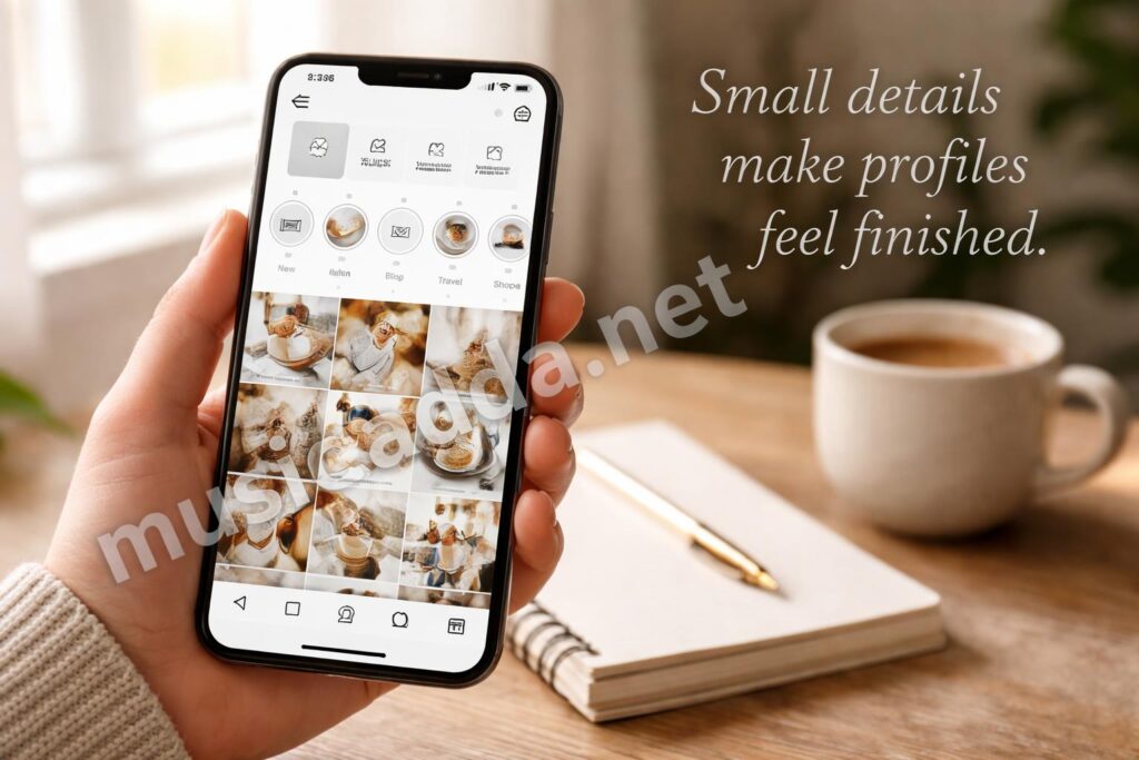
Instagram Highlight covers seem tiny, but they change the whole feel of a profile. The annoying part is that a lot of people still think you have to post the cover to your Story first, which can leave your feed looking messy for a day. You don’t.
The good news is that there’s a cleaner way to do it, and once you know the steps, how to add an Instagram Highlight cover without posting it to your story becomes a quick little task instead of a whole process. I’ll walk through the simplest method, a couple of easy fixes if something looks off, and the small mistakes that waste the most time.
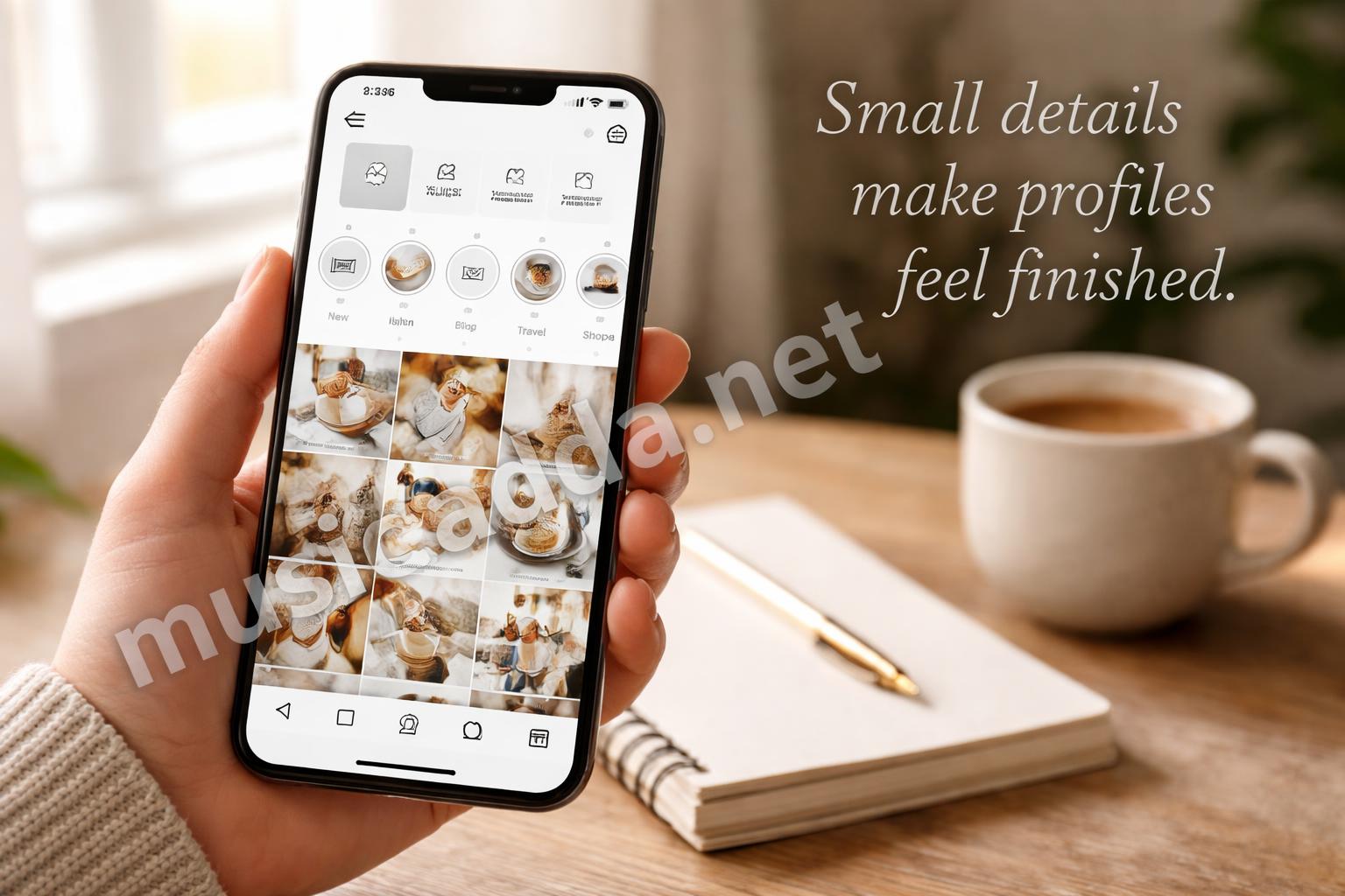
The quickest way to add an Instagram Highlight cover
The fastest method starts with a cover image that already exists in your phone’s camera roll or design app.
That matters because Instagram lets you change the cover from inside the Highlight settings, so you’re not really forced to publish anything publicly just to make it work.
Here’s the basic flow I’d use:
- Open your Instagram profile.
- Tap the Highlight you want to edit.
- Tap More or the three dots, then choose Edit Highlight.
- Tap Edit Cover.
- Pick the image you want from your gallery.
- Reposition it if needed, then save.
That’s the short version, and it’s usually enough. I’ve seen people overcomplicate this by trying to post a Story and delete it right away, which is exactly the kind of thing you don’t need to do.
The important part: choose the cover image first, then upload it from your device into the Highlight editor.
Set up the cover image before you touch Instagram
This is where most people save time, or waste it.
If your image is already ready, the whole job takes seconds. If not, you end up bouncing between editing apps, cropping too many times, and trying to guess what will actually look centered inside that little circle.
A few practical things help here:
- Use a square image if you can.
- Keep the main subject centered.
- Leave some breathing room around the edges.
- Make the design simple enough to read at small size.
That last one matters more than people expect. A cover can look great in your camera roll and still look cluttered on your profile once it’s shrunk down.
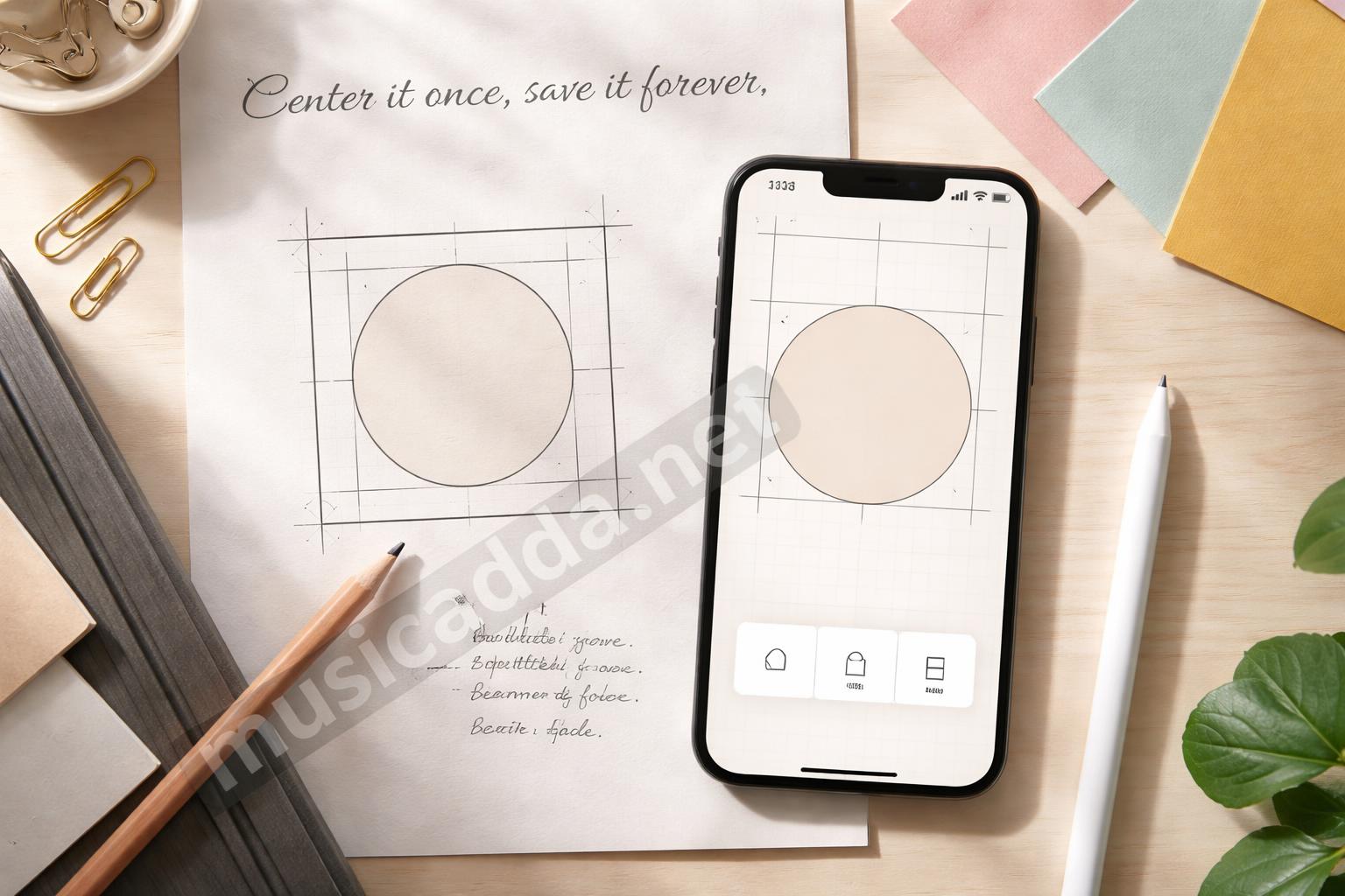
One thing I learned the hard way: busy covers can look fine for about two seconds, then they just blur into each other on the profile grid.
How to add an Instagram Highlight cover without posting to Story
If you want the cleanest version, this is the method to follow.
Step 1: Make the cover image on your phone
You don’t need a fancy editor. A simple Canva file, phone photo editor, or even a plain saved graphic works.
What matters is that the image is stored locally on your phone so Instagram can pull it from your camera roll.
Step 2: Open the Highlight and edit it
Go to your profile, tap the Highlight, and choose the edit option.
Instagram usually gives you an Edit Highlight screen where you can change the title, cover, and which Stories stay inside it. That cover section is the one you want.
Step 3: Choose the image from your gallery
When you tap Edit Cover, Instagram should open your camera roll or saved images.
Select the cover you made, then adjust the crop so the icon or text sits in the center of the circle preview. Don’t rush this part. The crop preview is small, and a design can shift just enough to look off-center if you’re careless.
Step 4: Save it
After you save, the new cover appears on your profile immediately.
No Story post. No temporary upload. No cleanup afterward.
That’s why this method is better than the old “post and delete” trick. It’s just less awkward.
If you still want a Story-based method, here’s the catch
Some people only realize they need a Highlight cover after they’ve already designed a Story-size graphic. That’s fine.
You can still use it without making your profile look messy, but you need to know one thing: if you upload it as a Story first, it will be visible for a while unless you take extra steps.
That’s why the direct cover-edit method is cleaner. For anyone trying to keep their Story feed tidy, the direct route saves you from explaining a random blank post, a logo slide, or a cover image that had no business being public in the first place.
If you’re just testing the look, upload the image to your phone first and skip the Story entirely.
Quick tip: if your design already exists as a Story draft, save the draft image to your device and use that file in the Highlight editor instead.
The right size and crop make a bigger difference than people think
This part is easy to ignore because Highlight covers are so small.
But the crop decides whether your cover looks polished or messy.
Instagram displays Highlight covers in a circle, so anything too close to the edge may get cut off. Text is especially tricky. A word that looks centered in your editor might sit too low or too high in the circular preview.
A simple rule helps:
- Put the main symbol in the middle.
- Keep text short.
- Use bold shapes.
- Avoid thin lines near the edge.
If you want something really clean, go for a logo-style icon or a single word. That usually reads best on mobile.
I also think people worry too much about making every cover different. A matched set looks better than a random mix of styles. Even simple covers can feel polished if the spacing is consistent.
A simple workflow that keeps covers consistent
If you manage a business profile, creator page, or just a personal profile with a specific look, consistency is the whole point.
Here’s a workflow that keeps things from looking random:
- Pick one color palette.
- Choose one icon style.
- Use the same crop spacing on every cover.
- Save all covers in one folder on your phone.
- Edit them one by one inside Instagram.
That folder part sounds small, but it helps more than you’d think. When you need to swap a cover later, you won’t be digging through screenshots and half-finished edits.
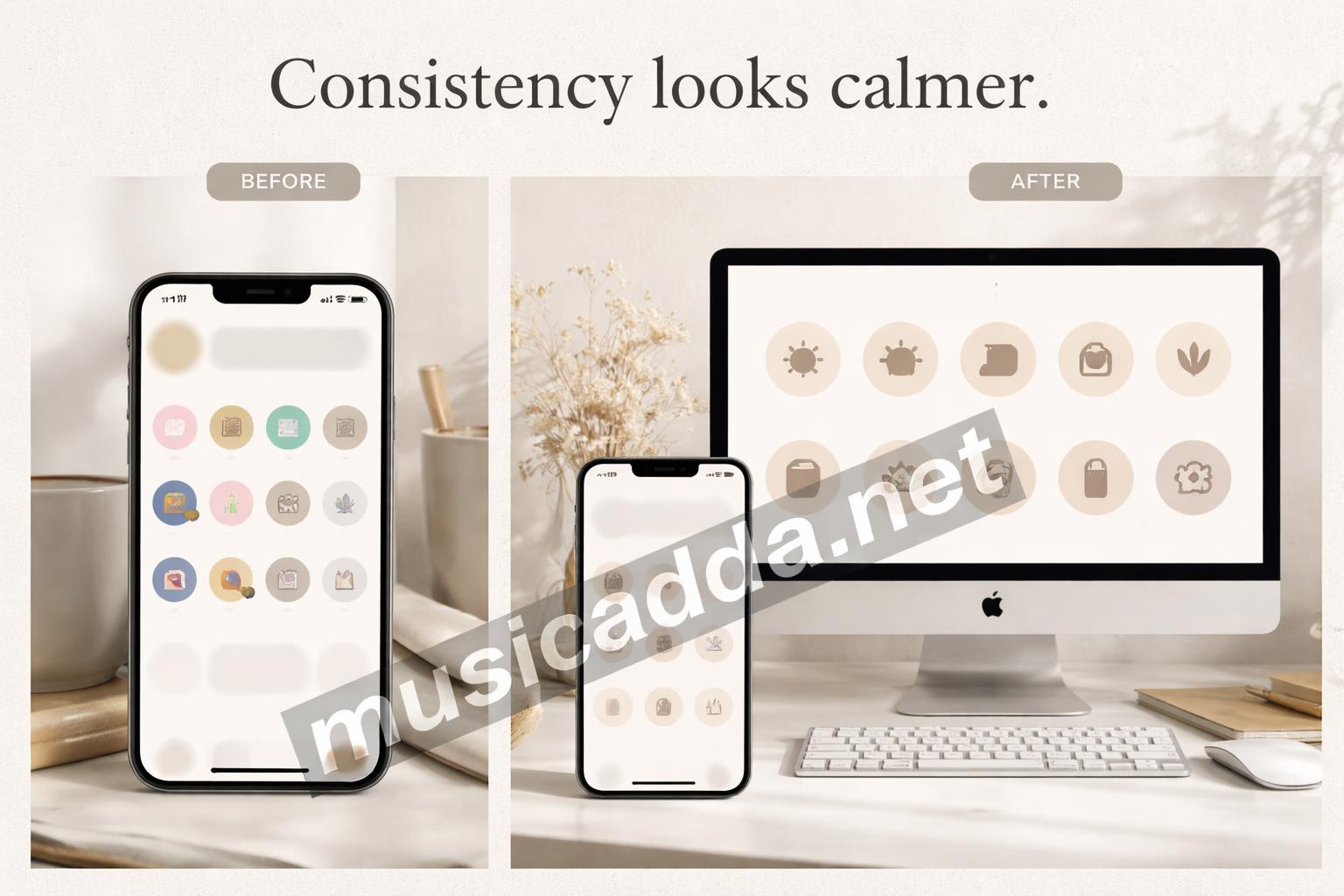
Best practice: make all your covers at the same time if you can. It’s faster, and the profile ends up looking much more intentional.
Common mistakes that make the cover look wrong
A Highlight cover can go wrong in a few predictable ways.
The image is too detailed
Tiny text and detailed photos usually disappear in the circle preview.
The crop is off-center
This is probably the most common mistake. The cover looks fine in editing, then the icon slides too far left after saving.
The colors are too close to the background
If the icon blends into the cover color, it won’t stand out on the profile.
The wrong file gets selected
This happens more than people admit. You think you picked the cover, but you actually grabbed an old screenshot or a blurry export.
I’d also avoid making the cover match the Story content too literally. The cover should work as a label, not just a snapshot. That’s why simple icons often do better than busy photos.
When you’re using a photo instead of an icon
A photo cover can look really nice, but it’s a little harder to make it work.
Photos usually need extra space around the subject because Instagram crops them into a circle. If the subject’s face, product, or object is too close to the edge, it gets awkward fast.
The easiest photo covers usually have:
- one clear subject
- plain backgrounds
- soft lighting
- no clutter in the corners
If you’re using a portrait or lifestyle shot, test it at a small size before saving. A photo that looks warm and personal can still become a blur when it’s reduced to a tiny profile circle.
For a lot of people, a photo cover works best for one or two Highlights, while the rest stay icon-based. That keeps things readable.
A tiny note on privacy and profile polish
Some readers care a lot about keeping their profile neat, and I get that.
Posting a Story just to make a cover feels a bit clumsy, especially if you’re trying to keep a clean brand page or a quiet personal account. The direct edit method solves that neatly.
If you want a cleaner setup overall, it helps to think about what belongs in your Highlights before you design the covers. That’s the same kind of planning people use when comparing options carefully, whether it’s a profile design choice or something more practical like how to compare home insurance quotes without getting blindsided. Different topic, same lesson: the final version matters more than the first thing you see.
A few quick fixes if Instagram won’t save the cover
Sometimes the steps are right, but Instagram still acts stubborn.
That usually comes down to one of three things: the image file, the app, or the crop.
Try these fixes:
- Re-save the image as a fresh JPEG or PNG.
- Restart the app.
- Check that the file is in your camera roll, not only inside another app.
- Crop it again with more space around the edges.
- Update Instagram if the edit screen glitches.
If the cover won’t move or the app freezes, I’d close it and reopen before doing anything else. That small reset fixes more problems than it should.
A handy fallback
If a design keeps failing, screenshot the finished image from your editor and use that version instead. It’s not always the perfect export, but it often behaves better inside Instagram.
What I’d do if I were setting up a whole profile today
I’d keep it simple.
I’d make one cover style, save all the graphics in one place, and use the direct edit method every time. No fake Story post, no cleanup, no weird half-published moment sitting on the profile.
For people who want to learn the process once and move on, that’s the best route. It’s also the easiest way to keep the look consistent later if you change your theme or rename a Highlight.
If you’re still choosing a design approach, it can help to check a quick how-to guide like this simple walkthrough on changing an Instagram Highlight cover in seconds. The steps are close to what you’d do here, but the key difference is using your saved image directly instead of sharing it publicly first.
Final thought
Once you’ve done it once, how to add an Instagram Highlight cover without posting it to your story stops feeling like a trick and starts feeling like the normal way to do it.
That’s really the main takeaway. Save the image first, edit the cover directly, and keep the crop simple. The profile looks cleaner, and you don’t have to delete a random Story just to get the result you wanted in the first place.
Save This Guide on Pinterest
Save this image to Pinterest so you can easily return to this guide later.