
Changing an Instagram Highlight cover sounds tiny, but it makes a profile look much more finished fast. If you leave the default cover in place, your Highlights can end up looking messy, and that usually makes the whole page feel less intentional. I’ve noticed that even a simple cover change can make old Stories feel organized again.
The good news is that learning how to change Highlight cover on Instagram only takes a few taps once you know where Instagram hides the option. I’ll walk you through the fastest way to do it, the little mistakes people make, and a few clean design tips so your covers look good instead of rushed.
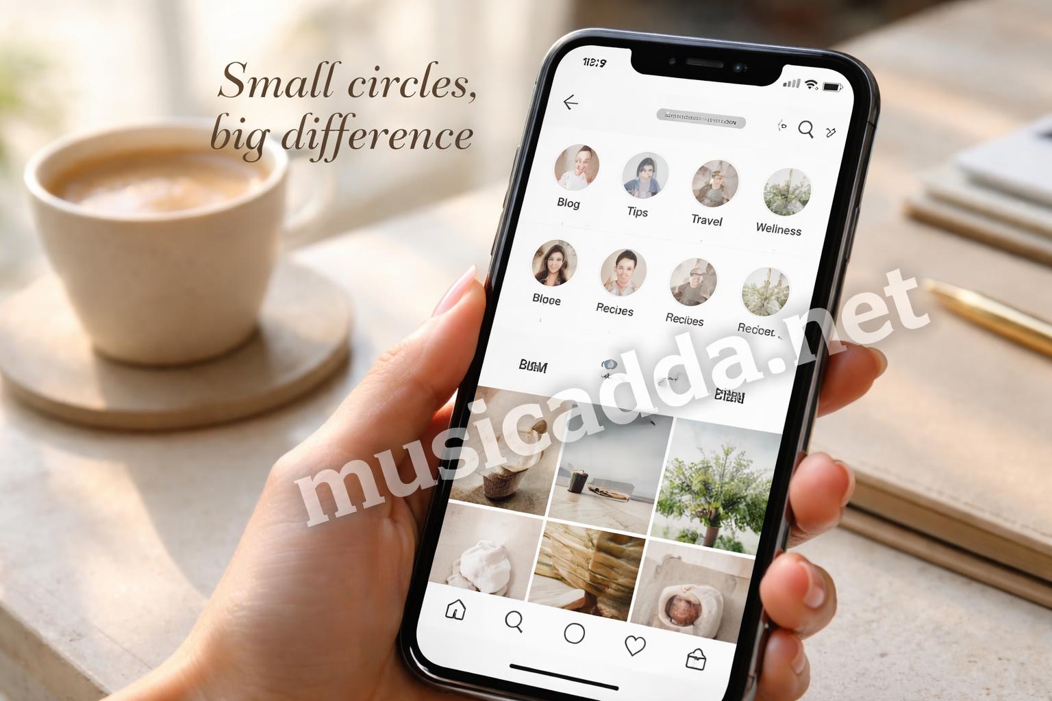
Why Instagram Highlight Covers Matter More Than People Think
A Highlight cover is basically the front door to a saved Story collection. When it looks clean, people can scan your profile faster and understand what you share right away.
That matters more than most people realize. On a busy profile, sloppy covers can make your page feel unfinished, even if the content itself is good.
If you post for a brand, a small business, or just your own personal style, this detail helps. It gives your profile a calmer look and makes your Highlights easier to tap through.
One thing I learned is that a cover doesn’t need to be fancy to work. It just needs to be clear.
The Fastest Way to Change a Highlight Cover on Instagram
If you only want the quickest path, this is it.
- Open Instagram and go to your profile.
- Tap the Highlight you want to edit.
- Tap More or the three dots in the lower corner.
- Choose Edit Highlight.
- Tap Edit Cover.
- Pick a new image from your Highlight or your camera roll.
- Adjust the image position if needed.
- Tap Done or Save.
That’s the basic flow. It usually takes less than a minute once you’ve done it once.
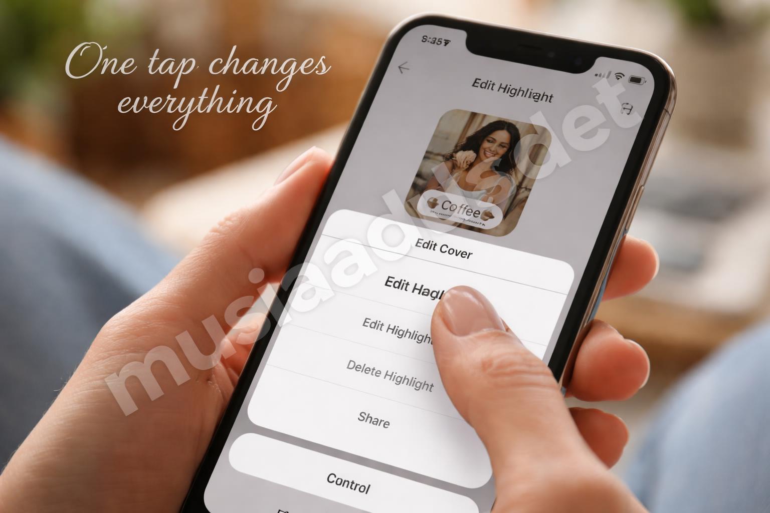
What I like about this method is that Instagram doesn’t force you to redesign the whole Highlight. You can swap only the cover and leave the Stories inside untouched. That’s helpful if the content is already fine and you just want the profile grid to look better.
How to Change Highlight Cover on Instagram from an Existing Story
A lot of people don’t realize you can use a Story frame as the cover image.
That’s useful if you already have a story with a nice photo, a clean background, or a simple graphic. It saves time and often looks more natural than picking a random image from your gallery.
Steps that usually work best
- Open the Highlight.
- Tap Edit Highlight.
- Choose Edit Cover.
- Swipe through the frames inside that Highlight.
- Select the Story image you want.
- Move it into place if Instagram lets you crop.
- Save the change.
This is the easiest route when your Highlights already have a strong first image.
I’ve made the mistake of picking a story frame that looked good in the Story itself but felt awkward as a tiny circle cover. Small crop, big difference. That’s why it helps to choose simple images with one clear subject or a clean background.
Using a Custom Image for a Cleaner Look
If you want your profile to look more polished, a custom cover is usually the better move.
That means using a made-for-cover image instead of a random Story screenshot. You can use a photo, an icon, a color block, or a simple design saved to your phone.
A custom cover works especially well when:
- you want matching colors across all Highlights
- you’re building a brand look
- your Story screenshots feel too busy
- you want the highlight names to stand out
If you want a cleaner visual style, this is where it pays to keep things simple. Tiny covers don’t need tiny details. Busy patterns often turn into visual noise once Instagram shrinks them down.
A simple rule I use
If I can’t understand the cover at a glance, it’s probably too detailed.
That’s why solid colors, short icons, and simple text-free images tend to work better than crowded graphics.
A Few Design Choices That Make the Cover Look Better
This part isn’t about rules. It’s about what actually looks good at Instagram size.
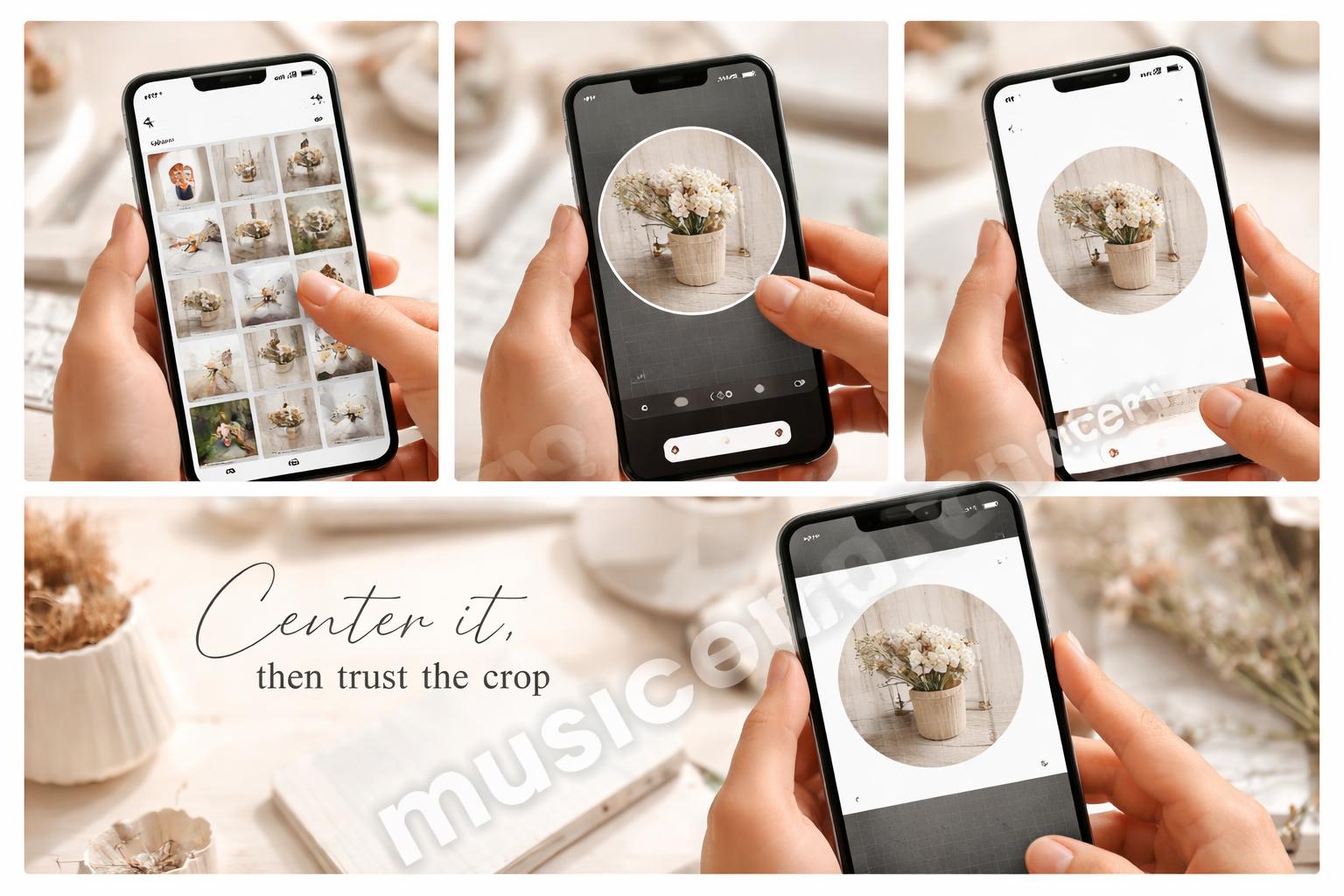
Keep the subject centered
Instagram crops Highlight covers into circles, and that crop can cut off edges fast. If your subject sits too far to the side, it may get clipped.
Use high contrast
Light on dark, or dark on light, usually reads better than soft mid-tones. The cover has to survive being tiny.
Avoid too much text
Text is fine in theory, but most of it gets hard to read once it’s shrunk down. If you do use text, keep it short and bold.
Match your profile mood
If your feed is soft and neutral, a neon cover can feel out of place. If your page is playful, a muted cover may disappear.

Best practice: choose covers that still make sense when they’re very small.
That one detail makes a bigger difference than most editing tricks.
What to Do If the Cover Won’t Save
Sometimes Instagram is a little annoying here. The cover changes, then the app refreshes, and suddenly it looks like nothing happened.
That doesn’t always mean you did it wrong.
Try these quick fixes:
- close and reopen Instagram
- check that the app is updated
- reselect the cover and tap save again
- switch between Wi-Fi and mobile data
- restart your phone if the app is acting weird
If the new cover still doesn’t stick, it may be a temporary app glitch. Instagram does that more often than people expect.
I’ve also seen covers display oddly for a few minutes before settling. So if you just changed it and it looks strange, give it a minute before you panic.
The Best Size and Crop Habits for Highlight Covers
Instagram doesn’t always make cropping obvious, so it helps to think ahead.
A Highlight cover is seen as a small circle, which means the outer edges matter less than the center. You want your main image or icon to sit right in the middle.
Quick crop habits that help
- keep important details away from the edges
- use square images when possible
- leave a little empty space around the subject
- test the image in a tiny preview before saving
If you’re designing your own cover, a square canvas usually gives you the most control. Then Instagram can crop the image into a circle without ruining the composition.
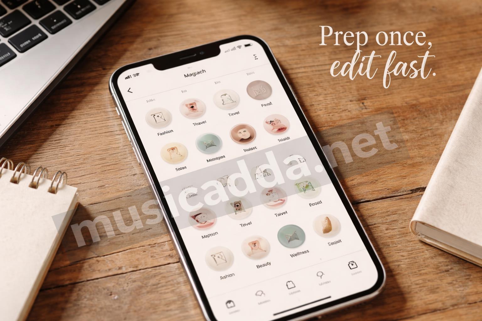
The tiny thing people miss is spacing. A cover that feels a bit too empty on your phone often looks perfect once it’s cropped into a small circle.
When You Want All Your Highlight Covers to Match
This is where your profile starts looking intentional.
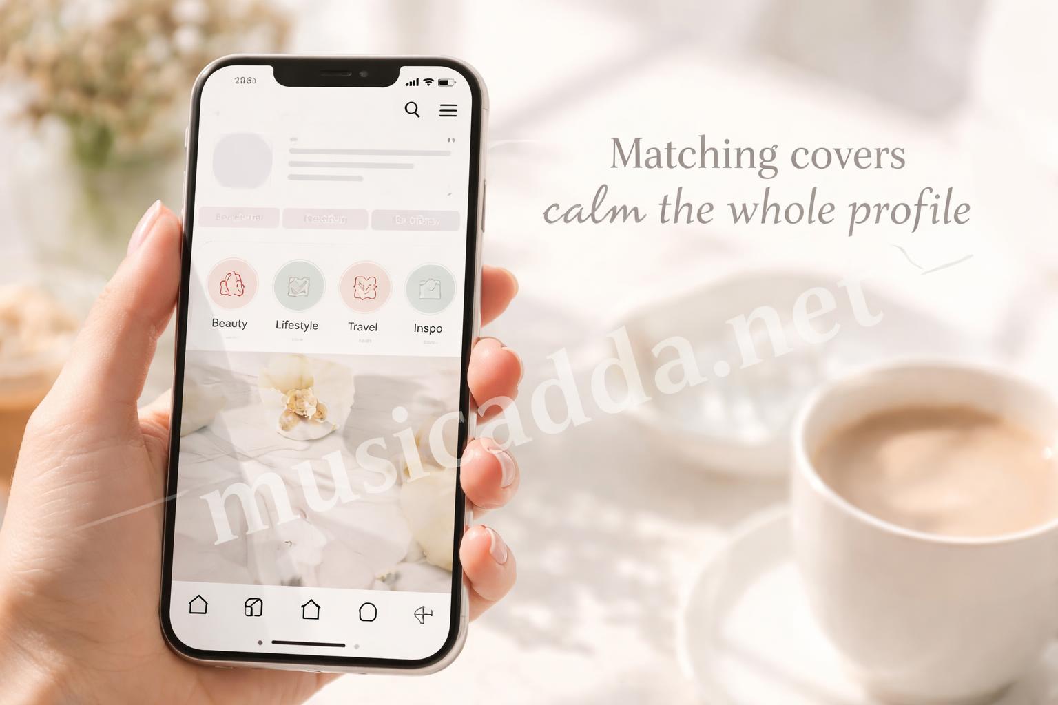
You don’t need a full design system. You just need repeatable choices. That might mean all-white covers, all-pastel covers, or one icon style for every category.
A matching set usually looks cleaner than a random mix, especially if your Highlights are important for visitors. It also makes it easier for people to scan your profile without thinking too much.
If you’re stuck on what style to use, it can help to think about the content itself. A food profile, for example, might lean toward warm tones. A travel page might work better with bright photos or simple location icons.
For a more social, lifestyle-based angle, I’ve seen pages pair Highlight organization with strong caption style too. If that’s your lane, a post like love captions for foodie couples on Instagram can give you ideas for the kind of tone your profile already carries.
A Simple Workflow That Saves Time
If you want to update more than one cover, don’t do it one by one with no plan. That gets messy fast.
Here’s a workflow that keeps things smoother:
- Choose your cover style first.
- Put all the cover images in one album or folder.
- Rename them if that helps you stay organized.
- Edit the first Highlight and check how it looks in the circle.
- Repeat the same crop position for the rest.
- Review the full profile grid after you’re done.
That last step matters. A cover can look fine individually but uneven when it’s sitting next to six others.
Surprisingly, the profile grid is usually where flaws show up first. A cover that feels “almost right” on its own can stand out in a bad way once it’s next to everything else.
If You Want Cleaner Results, Keep the Names Clear Too
This isn’t strictly about the image, but it affects the whole look.
A neat cover paired with a messy Highlight name can still feel off. Short names usually work better than long ones, especially when the cover itself is already doing visual work.
Good examples:
- Travel
- Food
- Work
- Tips
- BTS
- Shop
If you go too long, Instagram may cut the name off, and then the whole thing feels crowded.
Tiny note on naming
If your Highlights are meant to support a niche or personal brand, clean naming often helps the profile feel easier to trust. That’s why this also matters in content strategy, not just design.
For instance, if you care about profile polish in a broader sense, it helps to compare the look of your page the same way you’d compare other details carefully. I’ve seen that mindset show up in posts like how to compare home insurance quotes without getting blindsided, where the main lesson is really about not missing the small details that change the final result.
Common Mistakes People Make
Some mistakes are small, but they make the cover look off right away.
The usual ones
- choosing an image with too much detail
- placing the subject too close to the edge
- using a blurry screenshot
- mixing completely different visual styles
- forgetting to check the tiny circular preview
The blurry screenshot one is common. It might look fine in your camera roll, but once Instagram shrinks it down, the quality drops fast.
Another mistake is treating the cover like a full-size post. It isn’t. It’s a tiny badge. That changes everything.
Quick Fixes for Better Looking Covers
If your Highlight covers already exist and you just want a fast refresh, you don’t need to start over.
Try these easy upgrades:
- switch to one background color
- crop the subject tighter
- remove busy elements
- use the same filter or tone across all covers
- keep icons and shapes consistent
These small changes can make a profile feel cleaner without rebuilding the whole thing.
Quick tip: if one cover looks weird, change the whole set around it instead of only fixing that one.
Sometimes one oddball image makes the rest look less polished too.
A Note on Using Instagram’s Built-In Tools
Instagram gives you enough tools to change a cover quickly, but not always enough to make it perfect.
That means a little outside prep helps. If you want a custom design, make it first in your photo app or design tool, save it to your phone, then upload it during the cover edit step.
That usually gives you more control over:
- color
- spacing
- image quality
- consistency across covers
I like that approach because it avoids the rushed look. The app is fine for quick edits, but a little prep makes the result feel more deliberate.
For Instagram’s own help around app features and account tools, the official Instagram Help Center is still the safest place to double-check menu changes if the interface looks different on your phone.
Mini FAQ
Can I change a Highlight cover without changing the Highlight itself?
Yes. The cover and the Stories inside the Highlight are separate. You can update the cover without touching the saved content.
Can I use any photo as a cover?
Usually, yes. A photo from your camera roll or a Story frame can work, as long as it’s available in the edit flow.
Why does my cover look cropped wrong?
Most likely because the important part of the image is too close to the edge. Center it more and try again.
Do I need a design app?
No. But if you want a cleaner, more branded look, a simple design app helps a lot.
One Last Thing That Makes the Whole Process Easier
If you plan to update your profile often, save a few cover options ahead of time. That way you’re not hunting through old photos every time you want to clean up a Highlight.
That little habit saves more time than you’d think.
And honestly, that’s the main lesson here: how to change Highlight cover on Instagram is easy, but making it look good takes one extra minute of care. Once you build that habit, your profile starts feeling more put together without much effort.

Save This Guide on Pinterest
Save this image to Pinterest so you can easily return to this guide later.