Instagram Highlight Covers seem like a tiny detail, but they change how a profile feels fast. If they look messy or blurry, the whole page can feel less put together, even when the content is good.
That’s the annoying part. People skip this step, and then their Highlights look mismatched, low-res, or cropped wrong.
The good news is you can get free Instagram Highlight covers that still look clean and professional. I’ll walk through the easiest way to make them, what usually ruins the quality, and how to make simple covers that look polished without paying for a designer.
Why free Instagram Highlight covers often look cheap
Most of the time, the problem isn’t the idea. It’s the file quality.
A lot of free cover sets get ruined because they start as small images, use crowded icons, or get exported in the wrong format. Then they look fine in a preview, but once they sit inside the tiny Instagram circle, every flaw shows up.
The main thing to protect is clarity.
If the icon is too detailed, the color is too loud, or the canvas is the wrong shape, the cover starts looking like a rushed template.
I noticed this the hard way when I first tried designing a few covers quickly. They looked okay on my laptop, but on my phone they turned fuzzy and cramped. That tiny mismatch is what makes profiles look unfinished.
What to avoid from the start
- Tiny icons with thin lines
- Busy backgrounds
- Low-resolution downloads
- Text inside the cover
- Random cropping after export
A clean Highlight cover works best when it’s simple enough to survive Instagram’s compression. That’s really the whole trick.
How I’d make Instagram Highlight covers in Canva for free
Canva is one of the easiest ways to make covers without spending money, and the free version is enough for most people. If you want a simple walkthrough, this guide on creating Instagram Highlight covers in Canva for free is a useful starting point.
The setup matters more than the design. Once the base file is correct, the rest gets much easier.
Start with the right canvas
Use a square layout. Instagram Highlight covers are displayed as circles, but they start as square images, so that’s the safest format to design in.
A 1080 x 1080 canvas gives you enough room to keep things sharp. That size also helps the final image stay crisp after upload.
Keep the design inside the center
This part gets ignored a lot.
Because Instagram crops the cover into a circle, anything too close to the edges can disappear. I usually keep the icon or symbol inside a central safe zone and leave a little breathing space around it.
If your design looks great in a square but bad in a circle, it’s not ready yet.
Use free elements, but be selective
Canva’s free icon library is more than enough if you stay simple. The best covers usually come from:
- One icon
- One color background
- One visual style across all Highlights
That consistency matters more than fancy effects. A row of plain, matching covers often looks better than a set with too much variety.
The easiest way to keep quality high without paying for anything
If you want free Instagram Highlight covers that still look intentional, think in terms of restraint. Most people add too much because they’re trying to make the cover “pop,” but Highlight covers don’t need to shout.
They just need to be readable at a tiny size.
Keep icons bold, not delicate
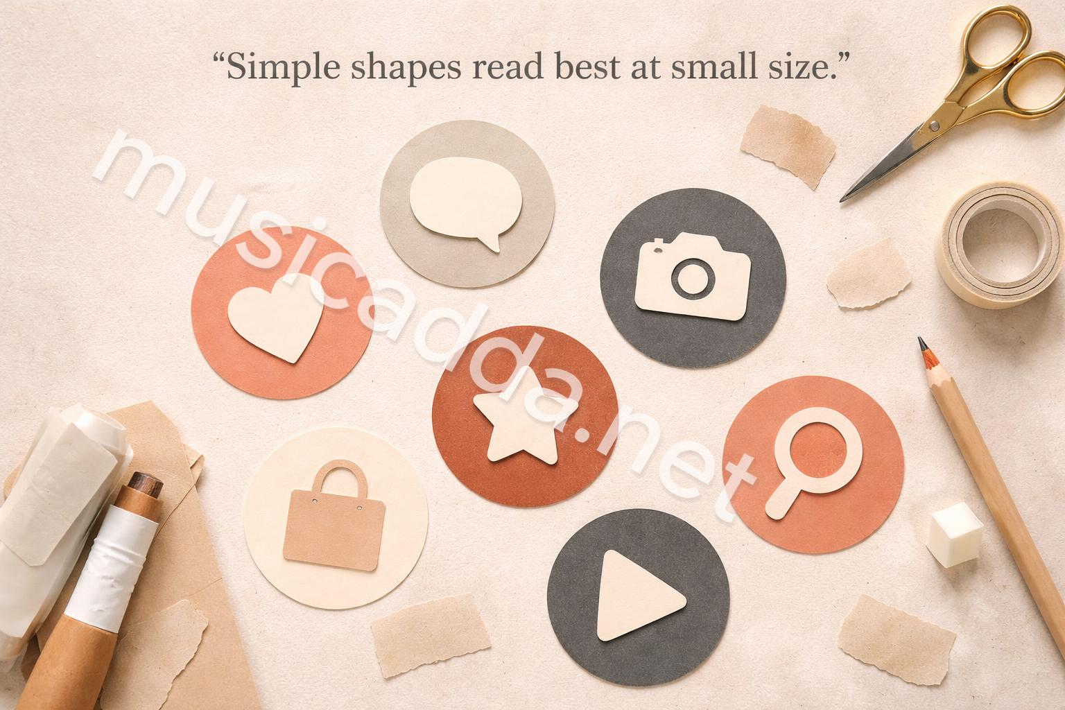
Thin line icons can disappear once uploaded. A solid symbol usually performs better because the shape stays visible inside the circle.
I’ve seen simple icons win every time. A small heart, star, camera, phone, or bag can do more than a detailed illustration with ten tiny parts.
Limit your color palette
One or two colors per set is usually enough.
A soft background with a darker icon often gives the cleanest result. High contrast helps, especially on mobile screens where the covers are very small.
Match the mood of the profile
This is where many people miss.
A personal brand, small business, lifestyle page, and creator profile all need different tones. A neon palette might be fine for one account, but it can look out of place on a calm, muted feed.
The cover should feel like it belongs to the profile, not like it was pasted on later.
A simple process that keeps the covers looking professional
You don’t need a complicated system. You just need a repeatable one.
Here’s the process I’d use if I were making a whole set from scratch:
- Decide on the Highlight categories first.
- Choose one style for all of them.
- Use the same icon weight across every cover.
- Keep each symbol centered.
- Export at high resolution.
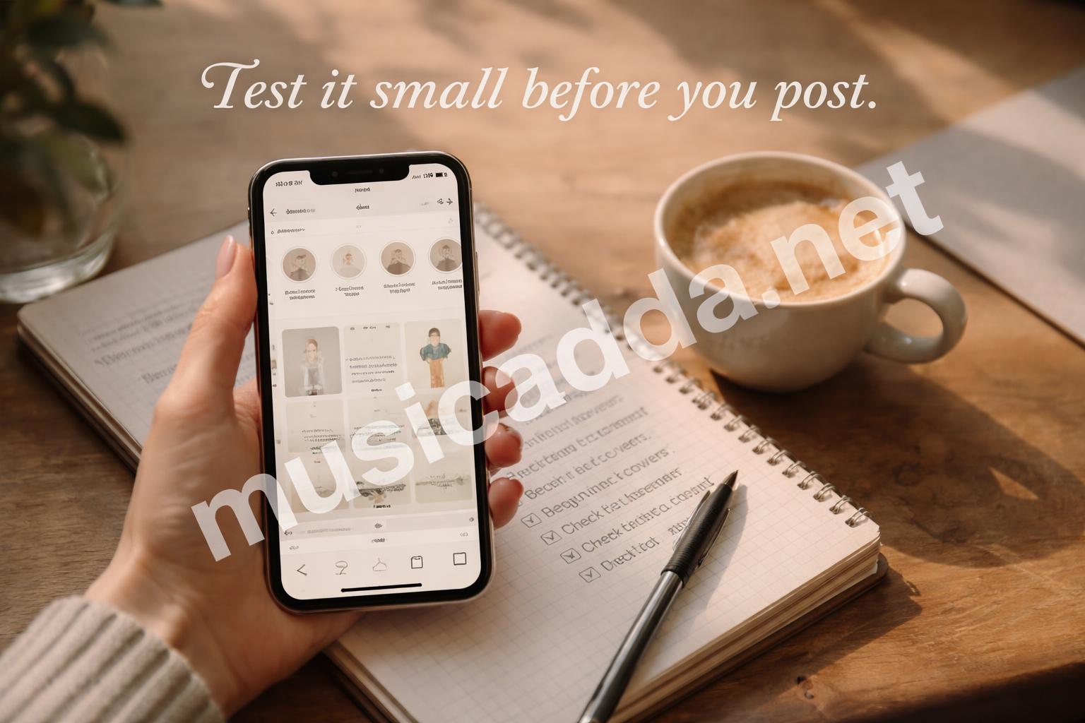
- Check the cover on your phone before posting it.
That last step is easy to skip, but it saves frustration.
Make the icons feel like a set
The biggest giveaway of an amateur cover pack is inconsistency. One icon is bold, one is thin, one is rounded, one is sharp. That breaks the visual rhythm.
A set works better when the icons feel related, even if they’re different shapes. Same line thickness, same style, same background tone. That’s enough.
Don’t over-design the background
A subtle solid color often beats a textured background. Textures can look nice in previews, but they don’t always survive compression well. On a small profile circle, texture can just become visual noise.
Free doesn’t have to mean generic
This is probably the part most people worry about. Free templates can look recycled, and a lot of them are. But that doesn’t mean free covers have to look bland.
The difference is usually in the choices you make.
Use a custom color combination
Even if you use the same icon set as someone else, your color choices can make the covers feel different. Slightly warmer tones, softer neutrals, or a darker contrast background can change the whole look.
Stick to fewer categories
If you try to design 12 different covers at once, the whole set starts to drift. It’s easier to make a strong profile when you only need covers for the most important Highlights.
Common categories might be:
- About
- Travel
- Favorites
- Shop
- Tutorials
- Reviews
- FAQs
You don’t need all of them. You only need the ones that actually matter on your profile.
Use spacing as part of the design
Empty space isn’t wasted space here. In fact, it’s one of the reasons covers look expensive.
A centered icon with open space around it usually looks more polished than a crowded graphic with too much going on.
How to make them look professionally designed
If you want a deeper look at design choices that make a cover pack feel polished, this guide on making Instagram Highlight covers look professionally designed covers the visual side well.
That said, the core idea is simple: professional design usually looks calm, not loud.
Use consistency as your main style
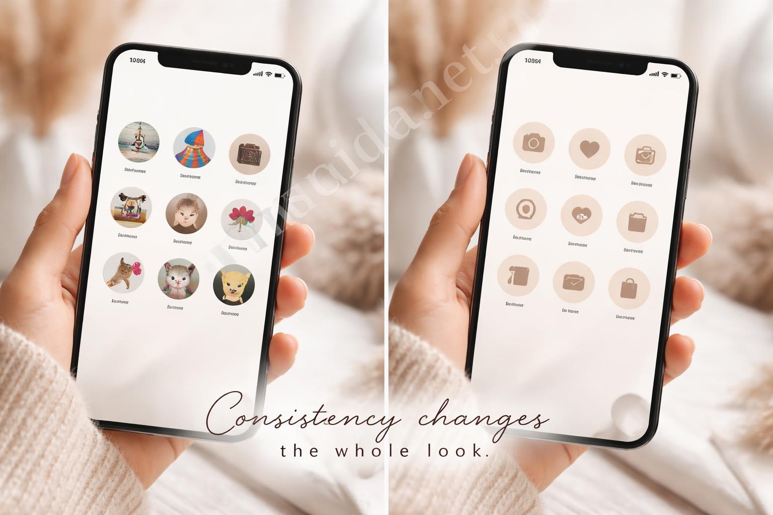
A professional set doesn’t need to be flashy. It needs to feel controlled.
That means:
- same icon style
- same background family
- same spacing
- same visual weight
When those things line up, the profile immediately looks more intentional.
Choose symbols that say something quickly
People scroll fast. They won’t stop to decode a clever icon.
A suitcase for travel, a cart for shop, a speech bubble for Q&A, a camera for content. Straightforward usually wins here.
Check how the cover looks as a tiny circle
This step is easy to skip in Canva because the square looks fine on the screen. But Instagram doesn’t show it as a square. It turns it into a circle, and that changes everything.
So before exporting, zoom out and mentally shrink the design. If it still reads clearly, you’re in good shape.
A few design mistakes that keep ruining free Highlight covers
I’ve seen the same mistakes repeat over and over, and they’re all fixable.
Mistake 1: using text inside the cover
Text almost always becomes too small. It looks neat in the editor, then turns unreadable once Instagram shrinks it.
If you need labels, let the Highlight name do the work.
Mistake 2: choosing icons with too much detail
Fine lines and detailed drawings can get muddy fast. A bold, simple shape is safer.
Mistake 3: forgetting to test the crop
A design may look centered on a square canvas and still feel off once it’s cropped into a circle. Centering matters more than most people think.
Mistake 4: exporting too small
This one is sneaky. The design might be good, but a low-resolution file can make it look soft and blurry.
Always export at the highest practical size for the format you’re using.
Where Instagram quality settings matter too
Instagram compresses a lot of uploaded media, so it helps to know how the platform handles visuals. The company’s own help resources are worth checking if you want a baseline for image quality and format behavior. I like to start with Instagram’s official help center when I want to confirm how uploads and profile visuals are handled.
That doesn’t mean you need to get technical. It just means you should assume compression will happen and design around it.
What that means in practice
- Use clean edges
- Avoid tiny details
- Upload sharp files
- Keep contrast strong enough to survive compression
It’s a little boring, but it works.
One small habit that helps
I started saving my final covers in one folder with clear names. That sounds obvious, but it makes updates easier later.
When you change your profile style six months from now, you’ll want the files easy to find. Otherwise you end up remaking something you already made.
If you want the cover set to feel premium, keep it boring in a good way
This sounds strange, but I mean it.
A good Highlight cover set doesn’t need to be exciting. It needs to be stable. When someone lands on your profile, they should notice the overall look without feeling distracted by the covers themselves.
That’s what premium usually looks like in practice.
Good signs your set is working
- The colors feel consistent
- Icons are easy to understand
- Nothing looks pixelated
- The covers don’t compete with your posts
- The profile feels more organized at a glance
If those things are true, you’re probably doing it right.
When to change the covers
You don’t need to redo them every week. But if your branding shifts, your content focus changes, or your profile theme gets cleaner, it’s worth updating the covers so everything matches.
I’ve found that small visual updates can make an account feel more current without changing the content at all.
Quick checklist before you upload
Here’s the fastest way to sanity-check your design before posting it:
- Is the canvas square?
- Is the icon centered?
- Does the image still look clear when small?
- Is the background simple enough?
- Do all the covers match each other?
- Does it fit the profile mood?
If the answer is yes to most of those, you’re close.
A better way to think about free design
A lot of people treat free design like a compromise. I don’t think that’s always true.
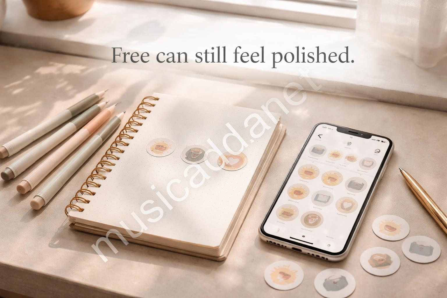
Free tools can work very well when you know what to keep simple. Canva, basic icons, a clean palette, and a little consistency can go a long way. The issue is usually not the tool. It’s the rush.
That’s why free Instagram Highlight covers can still look professional. They’re not expensive because they’re complex. They look good because they’re controlled.
Final thoughts
If you want your profile to look better without spending money, this is one of the easiest places to start. A small set of well-made covers can make your page feel calmer, cleaner, and more intentional right away.
And honestly, that matters more than people expect. When the visual system is consistent, the whole profile feels easier to trust.
The best part is that once you make one good set, the next one gets much easier. You stop guessing, and you start repeating what already works. That’s usually how the cleanest profiles are built.
Save This Guide on Pinterest
Save this image to Pinterest so you can easily return to this guide later.