Instagram Highlight covers look tiny, but they do a lot of work.
If your covers are messy, random, or hard to read, your profile can feel unfinished in a way that’s easy to ignore but hard to unsee. I’ve noticed that a small visual mismatch on a profile often makes everything else feel less intentional too.
The good news is that you can make clean Instagram Highlight covers in Canva for free, and you don’t need design experience to do it. I’ll walk through the whole process, from setting up the design to uploading the covers to Instagram and changing them later if you want.
Start with a simple idea, not a complicated design
A lot of people overthink highlight covers before they even open Canva.
That usually leads to tiny icons, too many colors, or covers that look nice on a big screen but blurry inside Instagram. I think the safer move is to keep the design very simple and let the profile layout do the work.
For most accounts, one of these directions is enough:
- Minimal icons like a camera, heart, food bowl, or star
- Plain shapes like circles, arches, or lines
- Short text-free symbols that still make sense at a glance
- Soft brand colors pulled from your existing feed
If you want your profile to feel polished fast, simplicity wins. The cover is there to organize your highlights, not steal attention from them.
One thing I learned early is that the best-looking covers are often the least fussy ones. A clean shape on a solid background can look more professional than a busy illustration.
Set up your Canva file the right way
Open Canva and create a design sized for Instagram highlight covers.
The easiest option is a square canvas, because highlight covers are built from square images even though they show up as circles on your profile. That mismatch matters more than most people think. If you place your icon too close to the edge, Instagram may crop it awkwardly.
Here’s the setup I recommend:
- Open Canva
- Create a custom size or choose a square template
- Use a 1:1 ratio
- Keep the design centered with plenty of empty space around it
- Save each cover as its own image
If you want a quick reference for how Instagram handles highlight graphics, this guide on changing a highlight cover on Instagram in seconds is useful before you start designing too many versions.
Build a cover that still looks good inside the circle crop
This part trips people up.
In Canva, your design may look perfectly centered. But once it’s uploaded to Instagram, the cover gets displayed inside a circle, and the edges disappear. So the real trick is to design for the crop, not just the canvas.
Keep the main icon in the center
Put your symbol or text in the middle third of the design.
That gives you room for Instagram’s circular crop and keeps the image readable on small screens. I usually avoid placing anything important near the outer 15–20% of the canvas.
Use bold, simple shapes
Thin lines can look elegant in Canva, but they often get lost once the image is reduced.
A thicker icon usually works better. The same goes for light-colored symbols on pale backgrounds. They may look airy on your laptop, then disappear on your phone.
Stick with one style across all covers
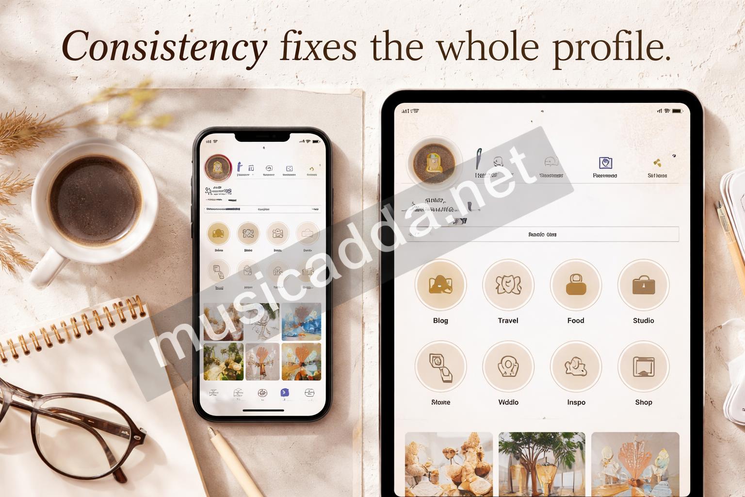
This is the part that makes a profile feel designed instead of patched together.
If one cover uses watercolor, another uses neon, and another uses a cartoon doodle, the page can start to feel random. A matched set feels calmer and more intentional.
Consistency matters more than complexity.
Make Instagram highlight covers in Canva for free
Canva’s free plan is enough for this job, and that’s one reason I like recommending it.
You don’t need premium graphics to make a neat cover set. Free shapes, free fonts, and a simple color background can get you surprisingly far.
Here’s a basic workflow that works well:
- Choose a background color
- Add a free icon or shape
- Center the icon carefully
- Remove extra clutter
- Download each cover as a PNG or JPG
If you’re making a full set, I’d suggest doing all your backgrounds first. Then add the icons one by one. That saves time because you can keep the same spacing and style across the whole group.
A small detail that makes a big difference: save a copy of your template. If you ever want to change one cover later, you won’t have to rebuild everything from scratch.
A quick style formula I trust
If you’re stuck, try this:
- Background: one flat color
- Icon: white or black
- Layout: centered
- Font: only if needed, and keep it bold
- Mood: clean, soft, or playful, but not all three
That formula is simple, but it works.
Choose colors that feel like your profile
Color does more for your covers than most people expect.
Even a very simple icon can look great if the color palette is right. On the other hand, a fancy icon on a clashing background can make the whole profile look noisy. I’ve seen that happen a lot when people choose colors they like individually, but don’t test them together.
A few safe ways to build color choices:
- Pull colors from your Instagram feed
- Use two or three brand shades only
- Keep high contrast between background and icon
- Avoid colors that look too close to each other
If your feed is bright and airy, soft neutrals usually work well. If your account leans bold and energetic, richer colors can fit better. The goal is not to make each cover unique. The goal is to make the whole row look like one system.
For anyone who wants a more polished result, this article on making Instagram highlight covers that look professionally designed is a good companion read after you choose your palette.
Download the file without making it blurry
This is another small step that matters more than it should.
If you download a low-quality image, the cover can look soft or pixelated once it’s uploaded. That’s annoying, because the design itself may be fine. The problem is usually just the export setting.
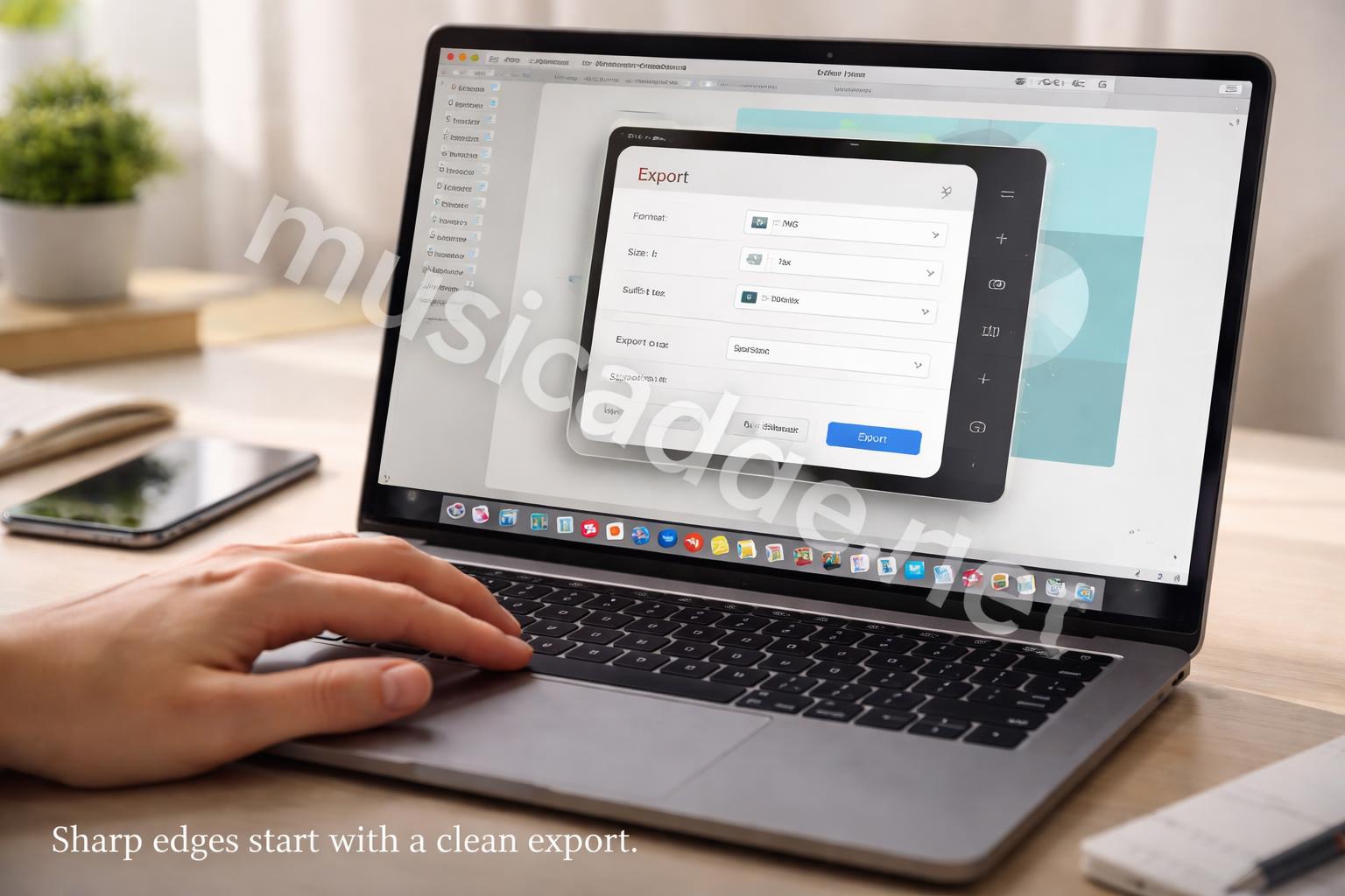
In Canva, export your cover as a PNG if you want crisp edges. JPG is fine too, especially for simpler images, but PNG tends to hold cleaner lines for icons and text.
A few practical things to watch:
- Don’t oversize the graphic with tiny details
- Export at the highest quality available on the free plan
- Keep the file name simple so you can find it later
- If needed, make one test cover first before doing the full set
I’ve found that the simplest designs survive export better than detailed ones. That sounds obvious, but it saves a lot of frustration.
Add the highlight cover to Instagram on iPhone or Android
Once your image is ready, the upload part is pretty fast.
If you already have a highlight created, you can edit the cover directly from the profile. If not, you can make a new highlight first and then set the cover after.
Here’s the general flow:
- Open Instagram
- Go to your profile
- Tap the highlight you want to edit
- Choose Edit Highlight
- Tap Edit Cover
- Pick the Canva image from your camera roll
- Reposition it inside the circle if needed
- Save it
The exact button labels can shift a little depending on the app version, but the process is usually close to this on both iPhone and Android. If you want a device-by-device walkthrough, this guide on adding Instagram highlight covers on iPhone and Android keeps it simple.
If the crop looks off
Don’t panic.
Instagram often lets you nudge the image left, right, up, or down before saving. That tiny repositioning step can fix a cover that looked wrong at first. I’ve had covers look slightly off-center in the preview, then become perfect with one small drag.
That’s why I always do a quick check before saving the final version.
A few mistakes that make covers look amateur
Most bad highlight covers come from the same handful of mistakes.
The good news is that they’re easy to fix once you notice them.
1. Too much detail
Small details vanish inside the circular crop.
If your icon has thin lines, tiny text, or complicated shadows, it may look muddy on the profile. Keep it simple and strong.
2. Random style mixing
One pastel cover, one neon cover, one photo cover, one doodle cover.
That mix can work for a playful account, but for most profiles it just looks accidental. A tighter visual system usually feels better.
3. Bad spacing
If the icon touches the edges, it feels cramped.
If it’s too tiny, it feels empty. I usually aim for a design that has some breathing room but still fills the center enough to be visible.
4. Using unreadable text
Tiny words inside a highlight cover usually don’t help.
If you want labels, consider adding them under the highlight on your profile theme instead. The cover itself should stay clean.
Quick rule: if it’s not readable at thumbnail size, don’t use it.
A simple Canva workflow I’d actually use again
If I were making a new set from scratch, I’d keep it moving like this:
- Pick three brand colors
- Choose one icon style
- Build the first cover
- Duplicate it for the rest
- Change only the icon and background shade
- Export everything together
- Upload and crop inside Instagram
That approach saves time and keeps the result consistent. It also helps if you manage more than one account, because you can swap colors without rebuilding the whole thing.
There’s a small advantage here that people miss: once your first cover is done, the rest become much easier. The template does the heavy lifting. That’s the real shortcut, not some hidden Canva trick.
Free Canva ideas that look polished without premium tools
You really don’t need the paid version for a good result.
I’d focus on the tools that matter most for this job:
- Shapes for backgrounds and frames
- Free icons for simple symbols
- Basic fonts if you want text-based covers
- Duplicate page to keep spacing consistent
- Position tools to center everything neatly
A nice thing about Canva is that even free designs can look custom if you keep them tidy. The cover doesn’t need to be flashy. It needs to be clear, balanced, and easy to recognize at a glance.
If you want a more lifestyle-style look, soft gradients or muted color blocks can work well too. Just keep the image simple enough that it still reads inside the circle.
What I’d do differently if I were making them today
I used to think highlight covers needed to be cute first.
Now I’d say they need to be useful first, cute second. That shift changes everything.
I’d rather have a set that looks calm, organized, and easy to recognize than a set that feels trendy for a week and then dated later. In practice, that means fewer gimmicks and more consistency.
One thing I learned is that your highlight covers don’t have to explain everything. If your cover says Travel, Food, or Work, great. But even without words, a clear icon can do the job just fine.
And if you change your theme later, Canva makes it easy to update the whole set without starting over. That flexibility is probably the biggest reason I’d still use it for free covers.
Final thoughts
If your Instagram profile feels a little messy, highlight covers are one of the fastest fixes you can make.
You don’t need a design background, and you don’t need premium tools. A clean Canva file, a simple icon, and a little care with cropping can make the whole profile feel more put together right away.
The part that matters most is not making them fancy. It’s making them consistent. Once you get that right, the rest is mostly just small adjustments.
Save This Guide on Pinterest
Save this image to Pinterest so you can easily return to this guide later.