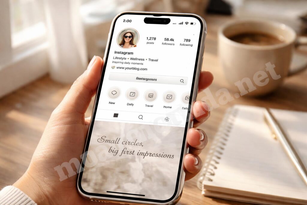
Instagram highlight covers seem small, but they shape the first impression your profile gives.
If they look random, the whole page can feel messy even when your content is good. I’ve seen that happen a lot, and the fix is usually simpler than people expect: a clean system, a few design choices, and a little restraint.
In this article, I’ll show you how to make Instagram highlight covers that look polished, match your profile, and don’t take forever to create. I’ll also point out the mistakes that make covers look amateur fast.
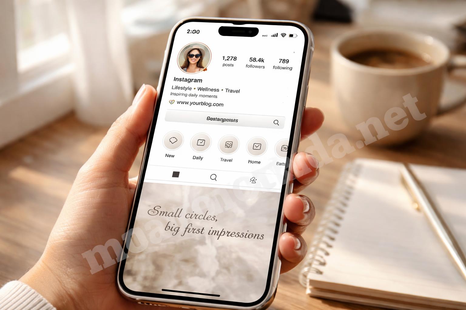
Why Instagram Highlight Covers Matter More Than People Think
Highlight covers are tiny, but they work like visual labels.
They help a visitor understand your profile in a second. If the covers are clean and consistent, your page feels intentional. If they clash, the profile starts to feel crowded, even if your photos are strong.
That’s the part many people miss. The covers are not decoration first. They’re navigation.
A good highlight cover should do three things:
- be easy to recognize at small size
- match the mood of your profile
- avoid visual clutter
The goal is not to make each icon exciting. The goal is to make the whole row feel organized.
I’ve noticed that people often try to cram too much detail into these tiny circles. That usually backfires. A simple symbol almost always looks better than a detailed illustration.
Start With a Clean Style Direction
Before opening any design app, decide what your profile wants to feel like.
That sounds obvious, but it saves a lot of time. If your feed is soft and minimal, bright neon covers will feel off. If your brand is playful, plain beige icons may look too serious.
A simple direction usually works best:
- Minimal: line icons, neutral colors, lots of space
- Soft and aesthetic: muted pastels, rounded symbols, calm backgrounds
- Bold and modern: strong contrast, solid colors, clear shapes
- Personal and casual: hand-drawn icons, warmer tones, relaxed style
One thing I learned the hard way is that mixing styles is what makes covers look “off,” not bad design skills. Even decent-looking covers can feel messy if half of them are flat icons and the other half are fancy gradients.
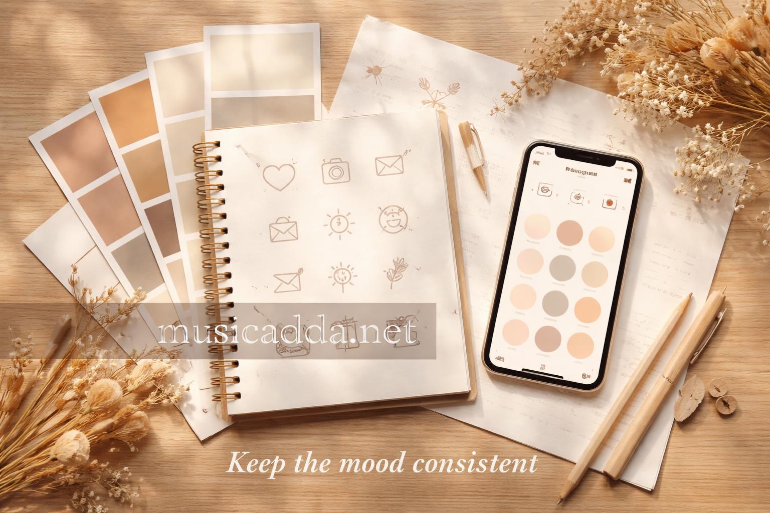
Choose Colors That Fit the Rest of Your Profile
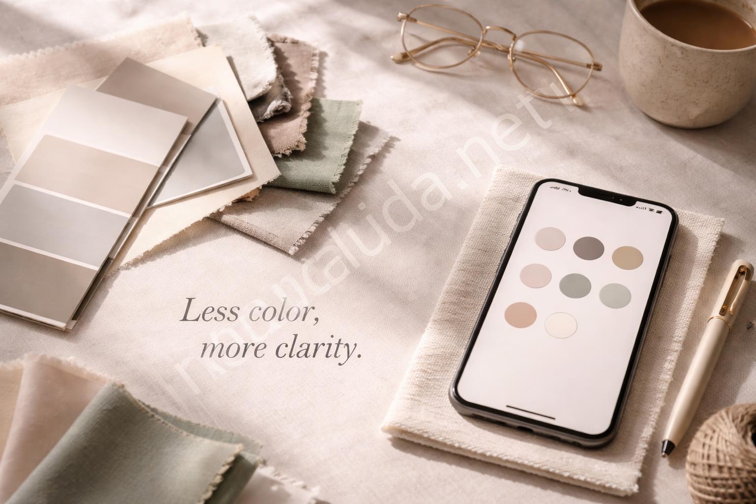
Color is the fastest way to make highlight covers look designed instead of random.
You don’t need a big palette. In fact, too many colors usually makes the row look noisy. I’d stick to two or three main shades, then one accent color if you want a little pop.
A simple method:
- Pick one background color family.
- Choose one icon color that stands out clearly.
- Keep every cover inside that same range.
For example, if your profile uses cream, tan, and soft brown, don’t suddenly add red, blue, and green highlight covers unless there’s a strong reason. The covers should feel like they belong to the page.
High contrast matters more than trendy colors. If people can’t see the icon clearly in a tiny circle, the design fails no matter how pretty it looks.
Keep the Icon Simple and Scannable
A tiny icon is not the place for detail.
That’s especially true on mobile, where most people will view your profile. A detailed camera, flower, star, or coffee cup can blur into a little shape blob once it’s shrunk down.
The best icons are usually the simplest ones:
- a heart
- a camera
- a speech bubble
- a shopping bag
- a location pin
- a music note
- a sparkle
- a bookmark
I’d also avoid using text inside highlight covers unless it’s just one letter or a very short initial. Words get hard to read fast.
If you want different covers for different categories, use symbols that make sense instantly. For example, a plane for travel, a plate for food, a gift for favorites, and a question mark for Q&A. That’s the kind of thing people understand without thinking.

Make Sure the Cover Works Inside the Circle
This is where a lot of good designs fail.
Highlight covers are shown inside a round crop, so your image needs breathing room around the edges. If your icon is too close to the border, part of it can look cut off or cramped.
A safe setup usually looks like this:
- place the icon in the center
- leave plenty of empty space around it
- avoid putting details near the edges
- check how it looks after cropping to a circle
Always preview the design at Instagram size, not just on your design canvas. Something that looks balanced in a square can feel oddly off once it’s reduced to a tiny circle.
I’ve seen people save covers they loved on the desktop view, then realize the tiny mobile version looked too busy. That’s a frustrating mistake, and it’s easy to avoid if you check the crop early.
How to Make Instagram Highlight Covers in a Design App
You don’t need complicated software for this.
Canva, Adobe Express, or even a simple phone editor can do the job. The process is basically the same: build a square cover, keep the design centered, then export it cleanly.
Here’s a practical workflow:
- Create a square canvas.
- Add a solid or soft background.
- Place one icon in the center.
- Keep the icon large enough to show clearly.
- Export the image in a crisp format.
- Upload it to Instagram and crop it carefully.
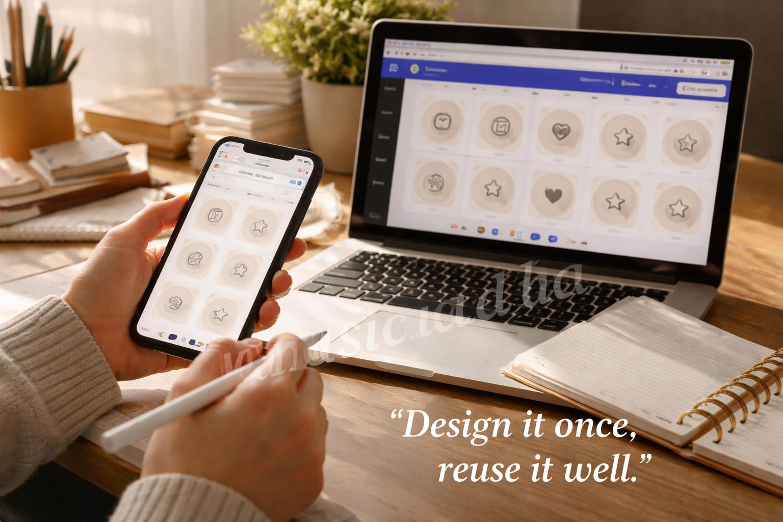
If you’re making several covers, duplicate the first one and change only the icon or color. That keeps the row consistent and saves time.
For people who want to learn the Instagram upload side faster, this guide on how to change a highlight cover on Instagram in seconds is useful because the design only works if the upload step is smooth too.
Create a Consistent Set, Not Just One Nice Cover
A single great cover is fine. A full matching set looks professional.
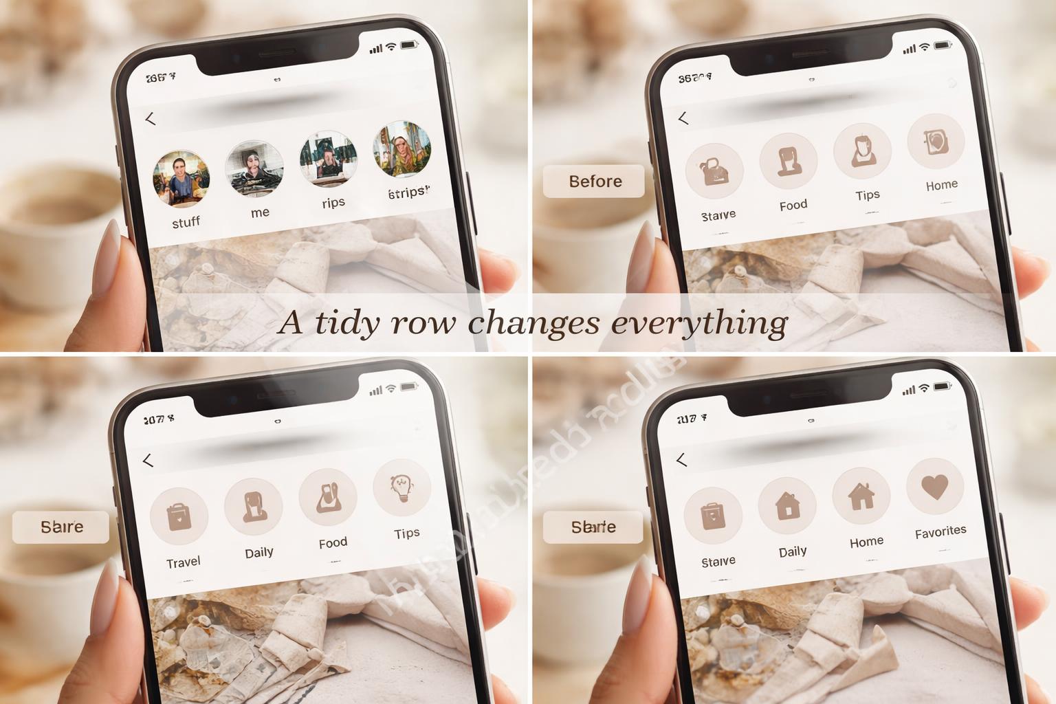
That’s because the row reads like a system, not a bunch of separate pictures. And once you have a consistent set, updating future highlights gets much easier.
A simple way to keep things aligned is to make one of these decisions and stick with it:
- same background color across all covers
- same icon style across all covers
- same line thickness across all covers
- same symbol placement across all covers
You don’t need to force every cover to be identical. In fact, a little variation helps. But the variation should sit inside a clear structure.
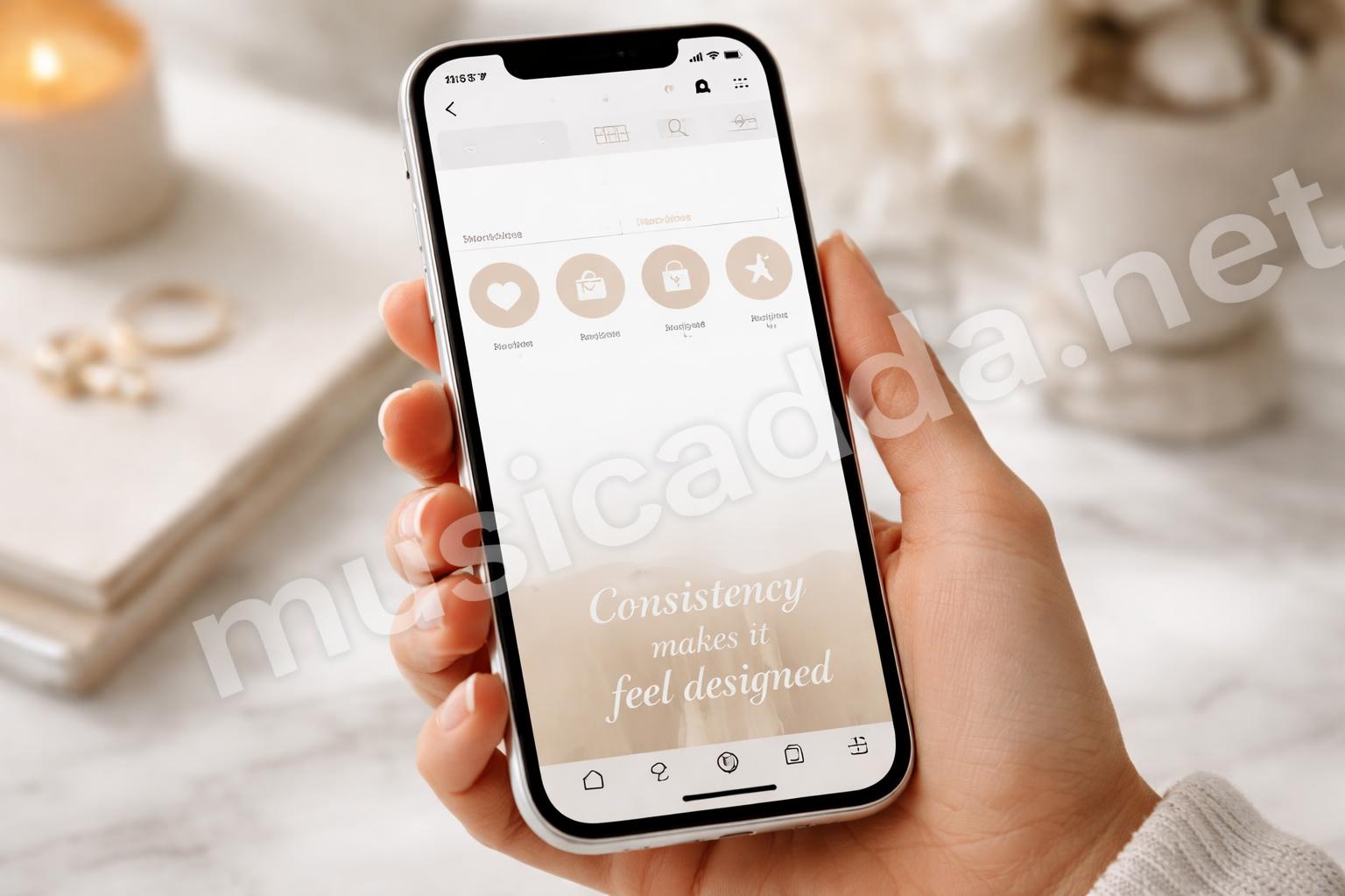
Consistency does the heavy lifting. It makes even basic designs feel intentional.
Common Mistakes That Make Covers Look Amateur
Most ugly highlight covers come from a few repeat mistakes.
The good news is that all of them are easy to fix once you know what to look for.
Too much detail
Tiny flowers, patterns, and complex illustrations often disappear at mobile size.
Weak contrast
If the icon and background are too similar, the cover becomes hard to read.
Inconsistent styles
Mixing line art, photos, and gradients in one set usually feels messy.
Off-center placement
Even a small shift can make a cover look unbalanced.
Trying to make every cover “cute”
That’s a fast way to lose clarity. Cute is fine, but readable comes first.
I’ve also noticed that people sometimes use stock-looking icons that don’t match the rest of their profile. That gives the covers a generic feel, even if the layout is clean.
A Simple Way to Make Covers Feel More Expensive
“More expensive” is really just another way of saying polished.
You get that feeling through restraint. Less color, fewer effects, and cleaner spacing usually help more than extra decoration.
A few small choices make a big difference:
- use matte backgrounds instead of noisy patterns
- keep shadows subtle or skip them
- use one icon style for the whole set
- leave enough empty space
- avoid glossy effects unless your whole brand uses them
If you’re making covers for a personal profile, soft neutral tones often feel calm and modern. If you’re making them for a creator page or business account, clearer contrast usually works better because it reads fast.
The design should feel easy on the eyes. That’s usually what people mean when they say something looks professional.
When Your Cover Set Needs More Personality
Not every profile should look minimal.
Some pages work better with a little character, especially if the account is personal, creative, or centered on relationships, fashion, or mood-based content. A softer icon set or a more emotional theme can feel more natural there.
That’s where category naming and cover design should work together. A highlight called “Love,” “Best Of,” or “My Days” can pair nicely with a cover that feels warm and expressive.
If your content leans romantic or social, I’d also look at caption style so the whole profile feels like one voice. Posts with the right tone matter just as much as the visuals, and these love captions that make your crush notice you can help keep that mood consistent across your page.
One thing I’ve noticed: when the cover style and caption style both match the same personality, the profile feels much more memorable.
Quick Checks Before You Publish
Before you set the covers live, do one last check.
It doesn’t take long, but it prevents a lot of redoing later.
Use this mini checklist:
- Does each icon still look clear at small size?
- Does the set feel consistent as a row?
- Do the colors match your profile?
- Is there enough empty space around each symbol?
- Would the cover make sense to a new visitor?
If you can answer yes to most of those, you’re probably in good shape.
It also helps to look at your profile the way a stranger would. That’s where small flaws show up. Something that seems fine up close can suddenly feel too bright, too crowded, or too plain once it sits next to your posts.
What to Do If You Don’t Want to Design From Scratch
Not everyone wants to start with a blank canvas, and that’s normal.
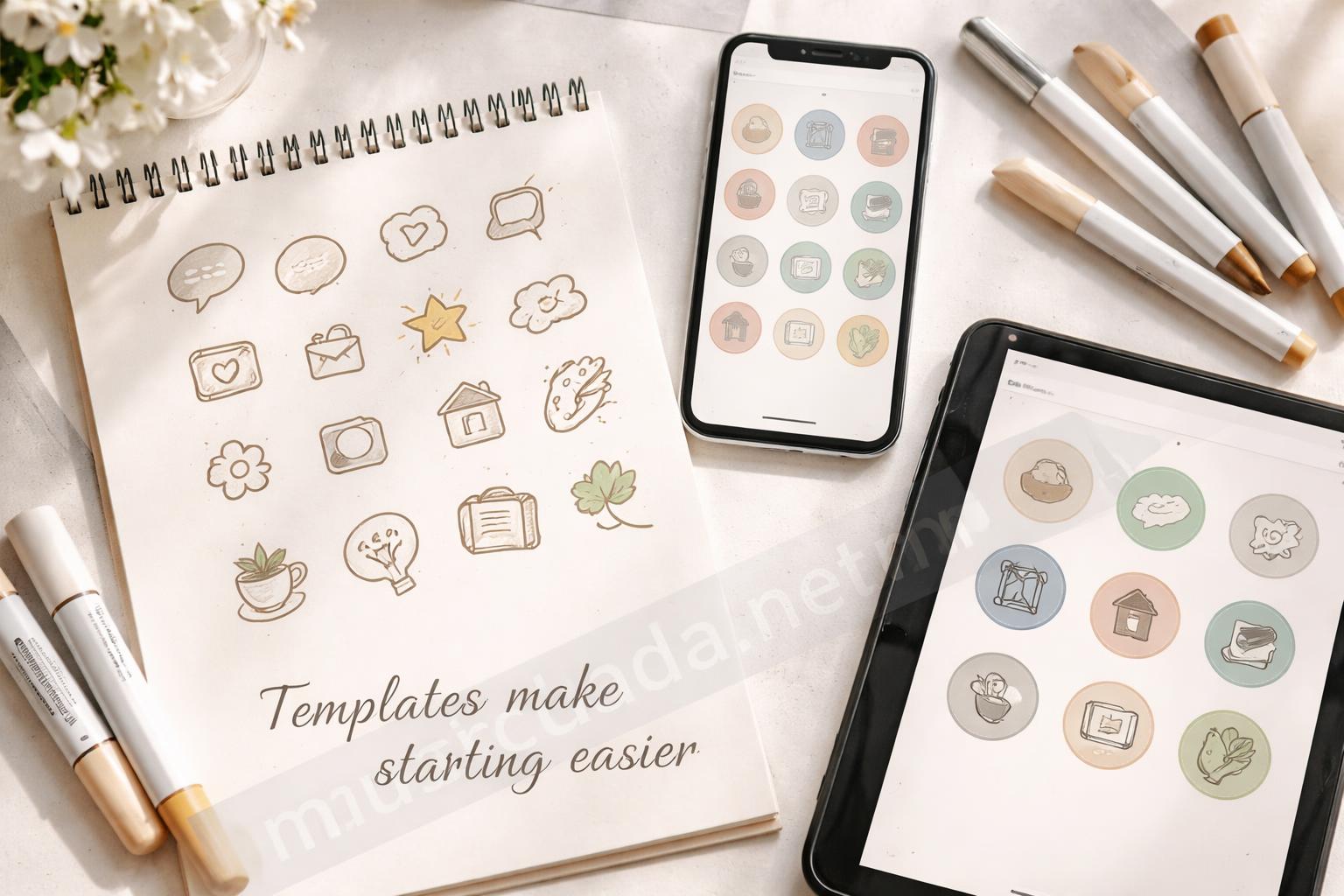
You can make the process easier by building from a template, then changing the icon and color to fit your page. That saves time and still gives you a custom result if you tweak it carefully.
If you’re using ready-made caption ideas for your posts, it can help to match the cover tone to the type of content you share most often. For example, if your posts get a lot of engagement from romantic content, this collection of best love captions for Instagram posts that get more likes can help you keep your visual and written style in sync.
The point isn’t to overthink every little detail. It’s to make sure your profile feels like one clear story.
Final Thought
A professionally designed highlight cover doesn’t need fancy effects or complicated art.
It just needs a clear idea, a consistent style, and enough discipline to keep things simple. That’s what makes the whole profile feel better at a glance.
If I had to narrow it down, I’d say this: simple, consistent, and easy to read will beat flashy almost every time.
And once you get that balance right, the rest of your profile starts looking more put together without much extra effort.
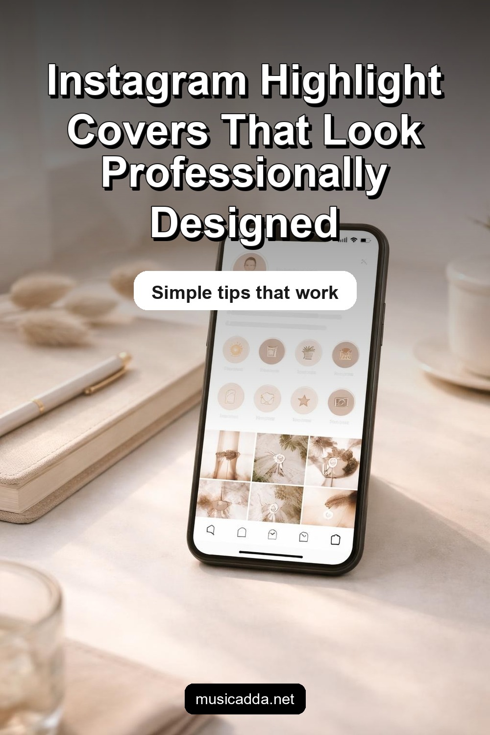
Save This Guide on Pinterest
Save this image to Pinterest so you can easily return to this guide later.