
A messy Highlight row can make even a nice profile feel a little unfinished. And if your covers don’t match, people notice fast.
The good news is that uploading a custom Instagram Highlight cover from your camera roll is pretty simple once you know where Instagram hides the option. In this post, I’ll walk through the exact steps, the small mistakes that trip people up, and how to make the cover look clean on your profile without deleting the Highlight itself.
The part most people miss first
Instagram doesn’t treat Highlight covers like a normal post image. That’s why the process feels a little odd the first time.
You’re not really “uploading” a cover as a separate post. You’re editing the Highlight, choosing a frame, and then moving in a custom image from your camera roll. That tiny difference matters, because if you tap the wrong thing, you can end up changing the whole Highlight instead of just the cover.
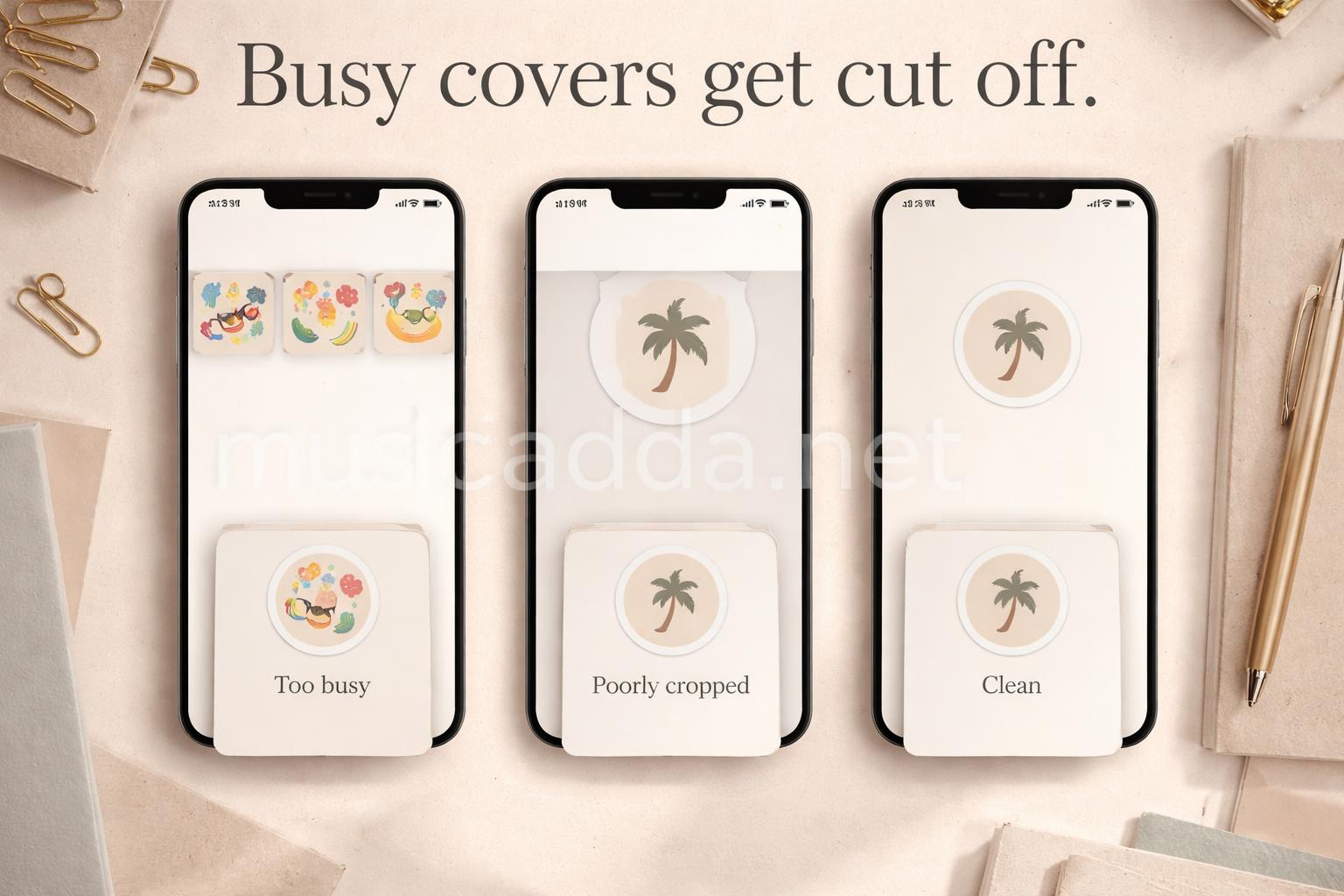
Most people also don’t realize the cover image will be cropped into a circle on your profile. So a design that looks great in your gallery can look slightly off once it’s sitting under your bio.
How to upload a custom Instagram Highlight cover from your camera roll
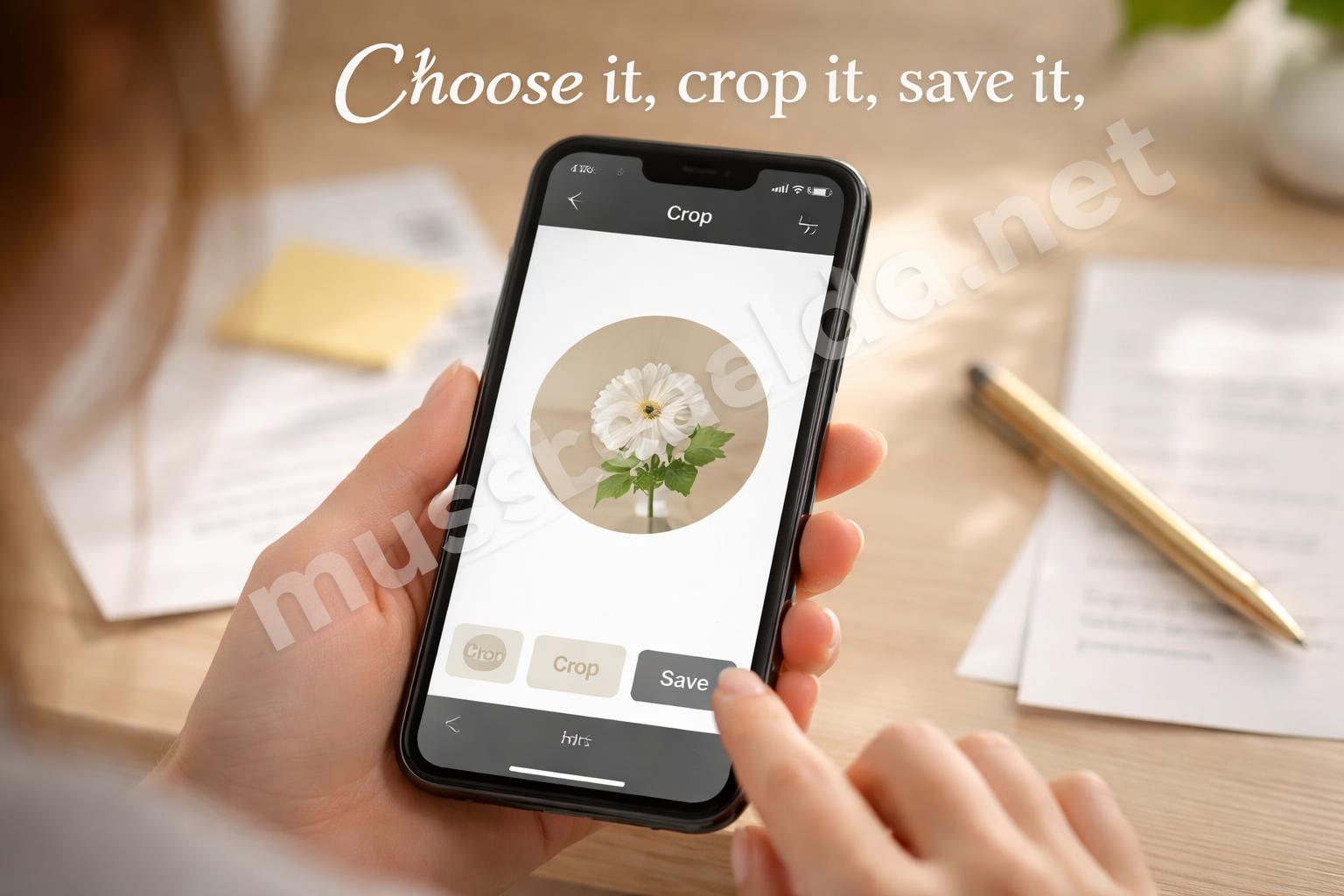
Here’s the cleanest way to do it on the app.
Step 1: Open your profile and pick the Highlight
Go to your Instagram profile and press the Highlight you want to edit.
If you don’t see it right away, scroll a little. That part is normal, especially if you have a lot of Highlights.
Step 2: Tap “More”
On the Highlight page, tap the More option, usually shown as three dots.
From there, choose Edit Highlight.
Step 3: Tap “Edit Cover”
Inside the edit screen, you’ll see the current cover at the top. Tap Edit Cover.
That opens the cover selector, and this is where the custom image part starts.
Step 4: Choose the image from your camera roll
Instagram often shows images from the Highlight itself first. Look for the gallery or camera roll option so you can pick a saved image from your phone.
Select the custom cover you want.
If you already saved a clean cover design to your camera roll, this is the easy part. If not, you’ll want to make that image first before you come back here.
Step 5: Reposition and crop it
Instagram lets you move the image around inside the circle.
Do this carefully. A centered icon usually works best, because the edges get cut off more than people expect.
Step 6: Save the change
Tap Done or Save, depending on your app version.
Your Highlight stays right where it is. Only the cover changes.
That’s the main thing people worry about, and it’s not a problem once you know the path.
How to make the cover look right on the profile
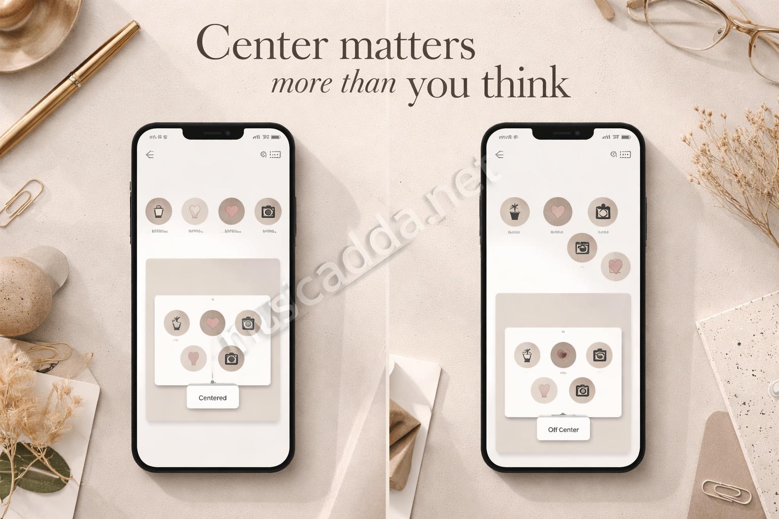
A Highlight cover only needs to look good in a tiny circle, so the design should be simple.
That means one symbol, one word, or one very small visual usually works better than a busy graphic. I’ve seen people use detailed photos, and they often look cramped once Instagram crops them down.
A few things help more than anything else:
- Keep the main icon or image in the center
- Leave empty space around the edges
- Use a clean background color
- Stick to one style across all Highlights
- Test it on your profile grid before saving
One thing I learned the hard way: a design can look balanced in your camera roll and still feel awkward on the profile because of the circle crop. Centering matters more than I expected.
Make the cover in your camera roll before you upload it
If you want the cover to look polished, create it first and save it to your phone. Then Instagram just becomes the place where you place it.
You can make this in a design app, a note app if you’re keeping it very simple, or even a plain background with a small icon. The format itself isn’t the tricky part. The tricky part is making sure it’s built for a circular crop.
For a cleaner result, use:
- Square dimensions
- A centered focal point
- A plain or lightly textured background
- Simple line icons
- Matching colors across all covers
If you want a more polished look, this guide on how to make Instagram Highlight covers that look professionally designed is worth a read before you start designing.
A quick design rule that saves time
If the image still looks good when you shrink it down, it’s probably fine.
That sounds basic, but it’s the best test I know.
Change the cover without deleting the Highlight

This part is where a lot of people get nervous. They think changing the cover might erase stories inside the Highlight. It won’t.
If you follow the normal edit path, you can change the cover and keep everything in place. That’s also why the process is safer than trying to rebuild the Highlight from scratch.
If you want the exact walkthrough for that, I’d also check how to change an Instagram Highlight cover without deleting the Highlight.
The practical benefit is simple: you get to improve the look of your profile without touching the content underneath.
That matters more than it sounds. A lot of people delay updating their covers because they’re scared of messing up the Highlight. Once you realize the stories stay put, it gets much easier to keep your profile fresh.
What makes a custom Highlight cover look clean
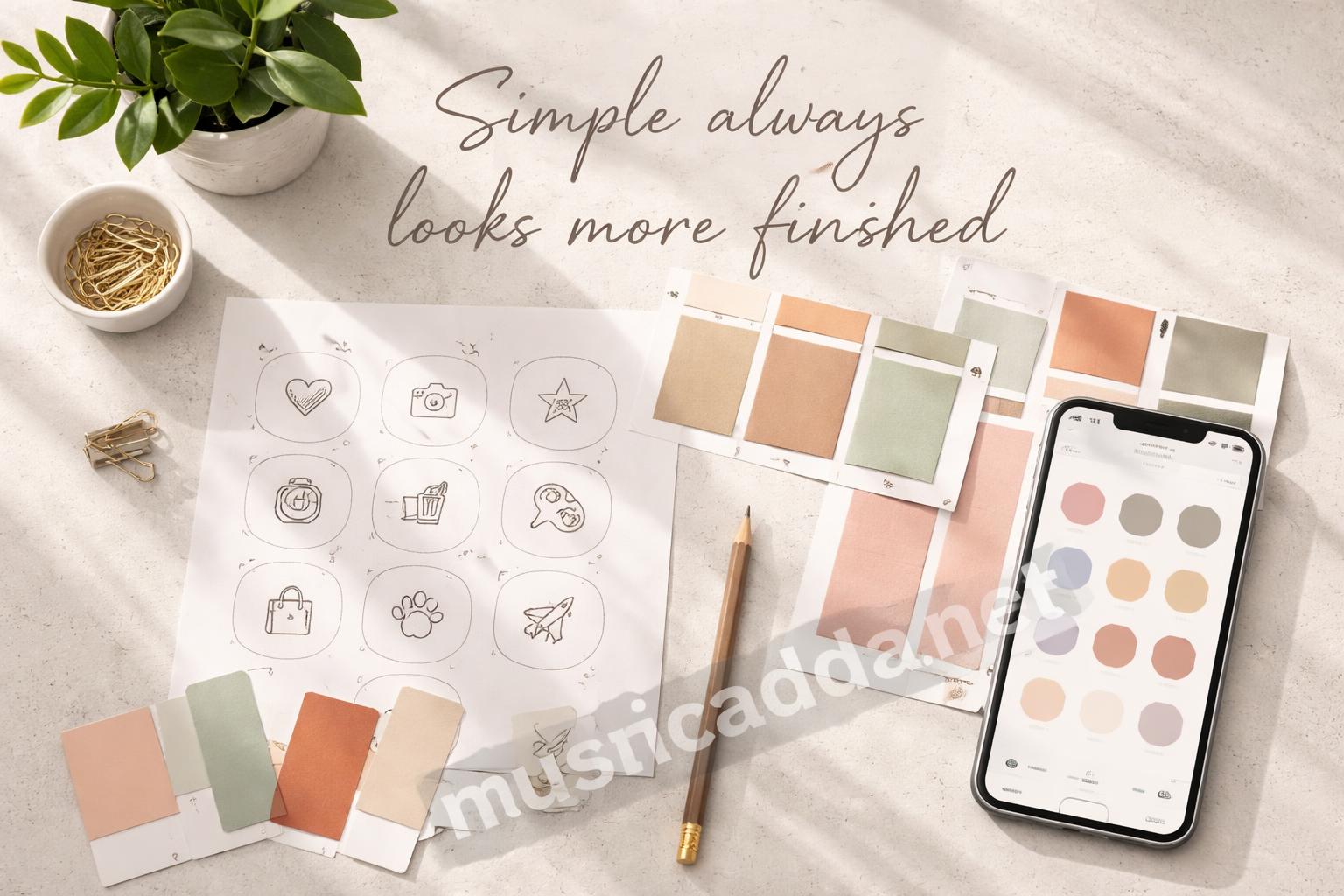
A good cover doesn’t need to be fancy. It needs to be readable.
That’s the main difference between something that looks “cute” and something that looks intentional. On Instagram, intentional usually wins.
Use consistency, not complexity
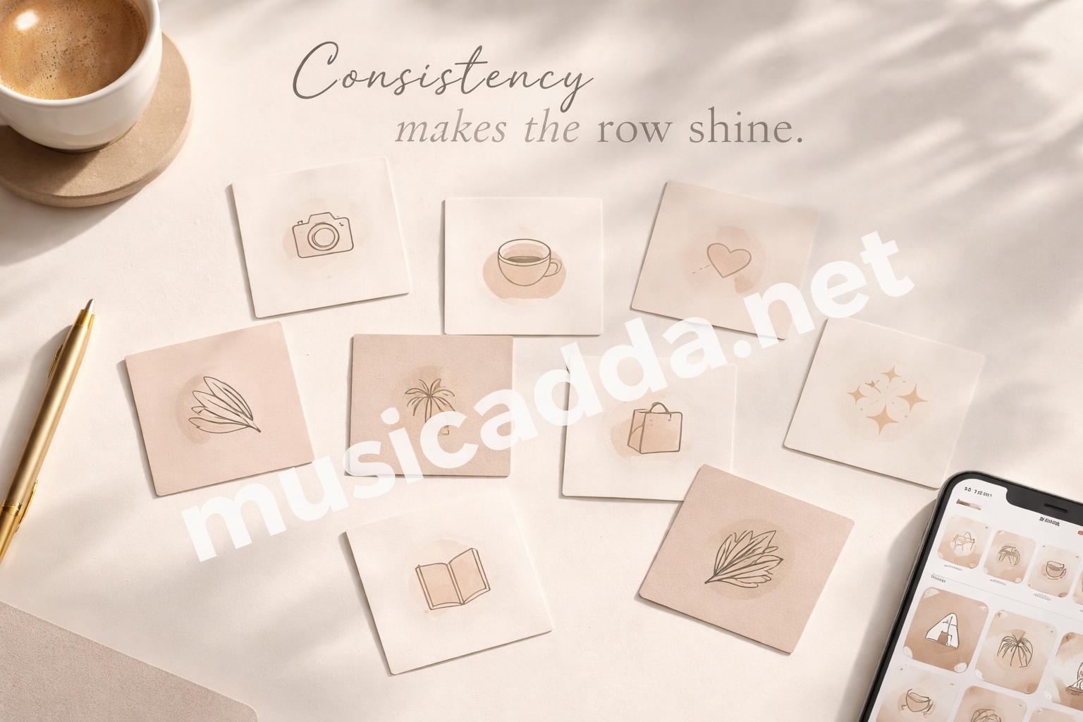
If every Highlight cover uses the same style, your profile instantly feels tidier.
You don’t need complicated art. In fact, too much detail usually works against you. Clean icons, matching colors, and the same visual spacing will do more for your profile than a highly detailed image ever will.
Stick to one visual language
This is where most people drift off track. One cover might be a photo, the next is a neon icon, and the next is a hand-drawn doodle.
That mix can work in some cases, but it often makes the row feel random.
A better approach is to choose one style:
- Minimal icons
- Soft pastel backgrounds
- Bold black-and-white covers
- Lifestyle photos with a filter
- Hand-drawn sketches
Any of those can work. Just don’t mix everything at once.
Keep text very short, if you use text at all
If you want words on the cover, keep them tiny and simple.
Two or three letters can be enough. Full words often look cramped in the circle and get hard to read. I’ve tried both, and the shorter version usually looks better from the profile view.
If your cover needs explanation, it’s probably too busy.
Small mistakes that make the cover look off
A few things can go wrong even when the steps are right.
The most common issue is cropping. People choose a nice image, but the important part sits too close to the edge. Instagram cuts it off, and suddenly the cover looks unbalanced.
Another issue is color mismatch. A bright cover on an otherwise muted profile can feel a little loud. That’s not always bad, but it should be a choice.
Here are the mistakes I’d watch for:
- Using a cover that’s too detailed
- Placing the icon too close to the edges
- Picking low-resolution images
- Mixing styles across every Highlight
- Forgetting to preview the crop
A small annoyance I’ve noticed is that Instagram sometimes makes the cover feel slightly darker or flatter than it looks in your gallery. So if you’re on the fence between two similar images, choose the simpler one. It usually survives the crop better.
A simple workflow that makes this easier
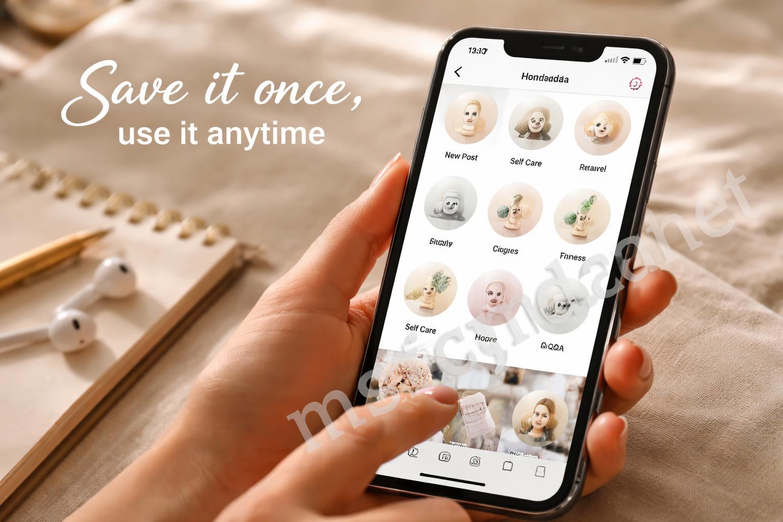
If you change covers often, it helps to use the same mini workflow every time.
I’d do it like this:
- Create the cover in square format
- Save it to your camera roll
- Open the Highlight
- Tap Edit Highlight
- Tap Edit Cover
- Pick the image
- Center it in the circle
- Save and check your profile
That’s it.
The reason this works is that it removes guesswork. You’re not trying to design and upload at the same time, which is where most people slow down.
Honestly, the fastest fixes usually come from having a repeatable process, not from making the design more complicated.
When the cover still doesn’t look right
Sometimes the upload works, but the result still looks off.
That usually means the problem is the image, not Instagram.
Try these quick fixes
- Use a cleaner background
- Move the icon farther from the edges
- Reduce text size
- Pick a simpler graphic
- Save the image again in higher resolution
- Check whether the image was already cropped before upload
If the cover is blurry, the original file may be too small. If it looks too crowded, the design may need more breathing room.
And if the cover looks fine in the editor but odd on the profile, that’s usually the circle crop doing its thing. The editor view can be a little misleading.
A quick reminder
Your cover is mostly for your profile page.
It doesn’t need to tell the whole story. It just needs to help people recognize the Highlight fast.
What I’d do if I were setting up a new profile
If I were starting from scratch, I’d keep it simple and make all the covers before touching Instagram.
That means choosing one color palette, one icon style, and one background shape. Then I’d save all the images to the camera roll and upload them one by one.
That approach saves time later, especially if you end up changing your mind about the look.
I’d also keep the names of the Highlights short. A clean cover paired with a short title usually feels better than a busy cover paired with a long label.
My practical rule
If the Highlight title and the cover both need a lot of explanation, the setup is probably too complicated.
That doesn’t mean it’s wrong. It just means the profile could be cleaner.
A quick note on making the whole profile feel better
A custom cover is small, but it changes the way the profile feels right away.
That’s why people notice it even when they can’t explain why. A neat Highlight row makes the page feel cared for. A mismatched one makes the profile feel a little unfinished.
If you want a faster edit, check how to change a Highlight cover on Instagram in seconds. It’s the kind of small fix that makes sense once you’ve done it once.
Final thought

Uploading a custom Instagram Highlight cover from your camera roll is one of those tiny profile tweaks that feels minor until you see the difference.
The whole thing gets easier once you remember two things: keep the image simple, and don’t overthink the crop. After that, it’s mostly just a matter of saving the right file and placing it in the right spot.
I still think the best covers are the ones that look almost effortless. They’re the ones people notice without really noticing, and that’s usually the sweet spot.
Save This Guide on Pinterest
Save this image to Pinterest so you can easily return to this guide later.