Changing an Instagram highlight cover without deleting the highlight is one of those tiny profile fixes that can make your page feel much cleaner fast. If you’ve ever opened your profile and noticed a cover that feels off, mismatched, or just plain messy, the good news is you don’t have to start over.
If you ignore it, the highlight stays there, of course, but your profile can look less polished than it should. And if you’re trying to keep a consistent look, that one cover can throw everything off.
I’ve seen this trip people up because Instagram doesn’t make the process feel obvious. So in this article, I’m walking through how to change an Instagram Highlight cover without deleting the Highlight, plus a few small things that make the whole thing easier.
The quickest way to change an Instagram Highlight cover
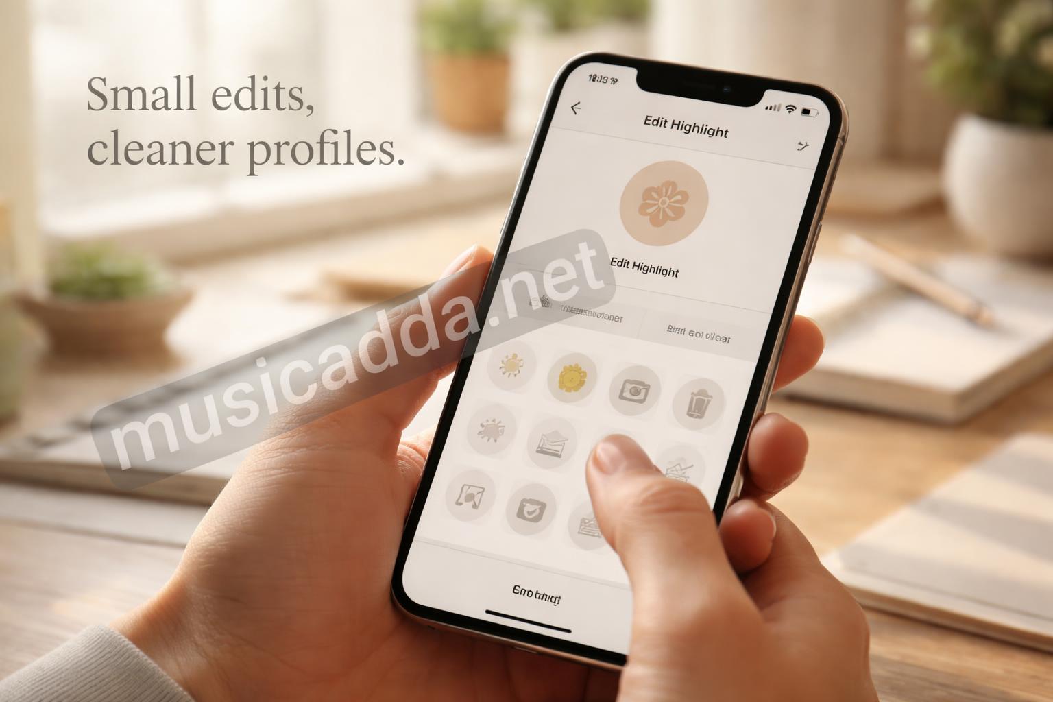
The fastest method is to open the Highlight, edit it, and swap the cover image from inside the settings. You’re not deleting anything, and you’re not rebuilding the Highlight from scratch.
Here’s the basic flow:
- Go to your Instagram profile.
- Tap the Highlight you want to change.
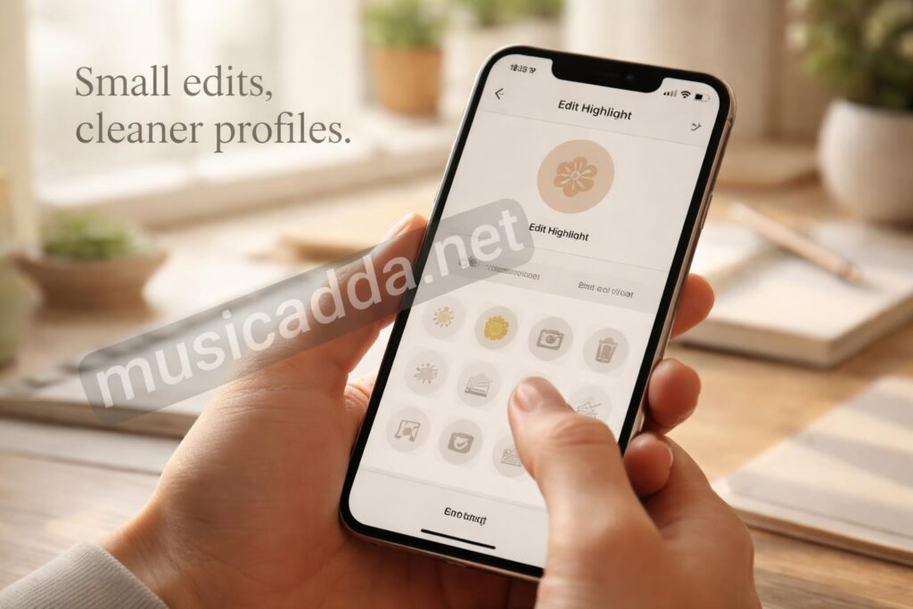
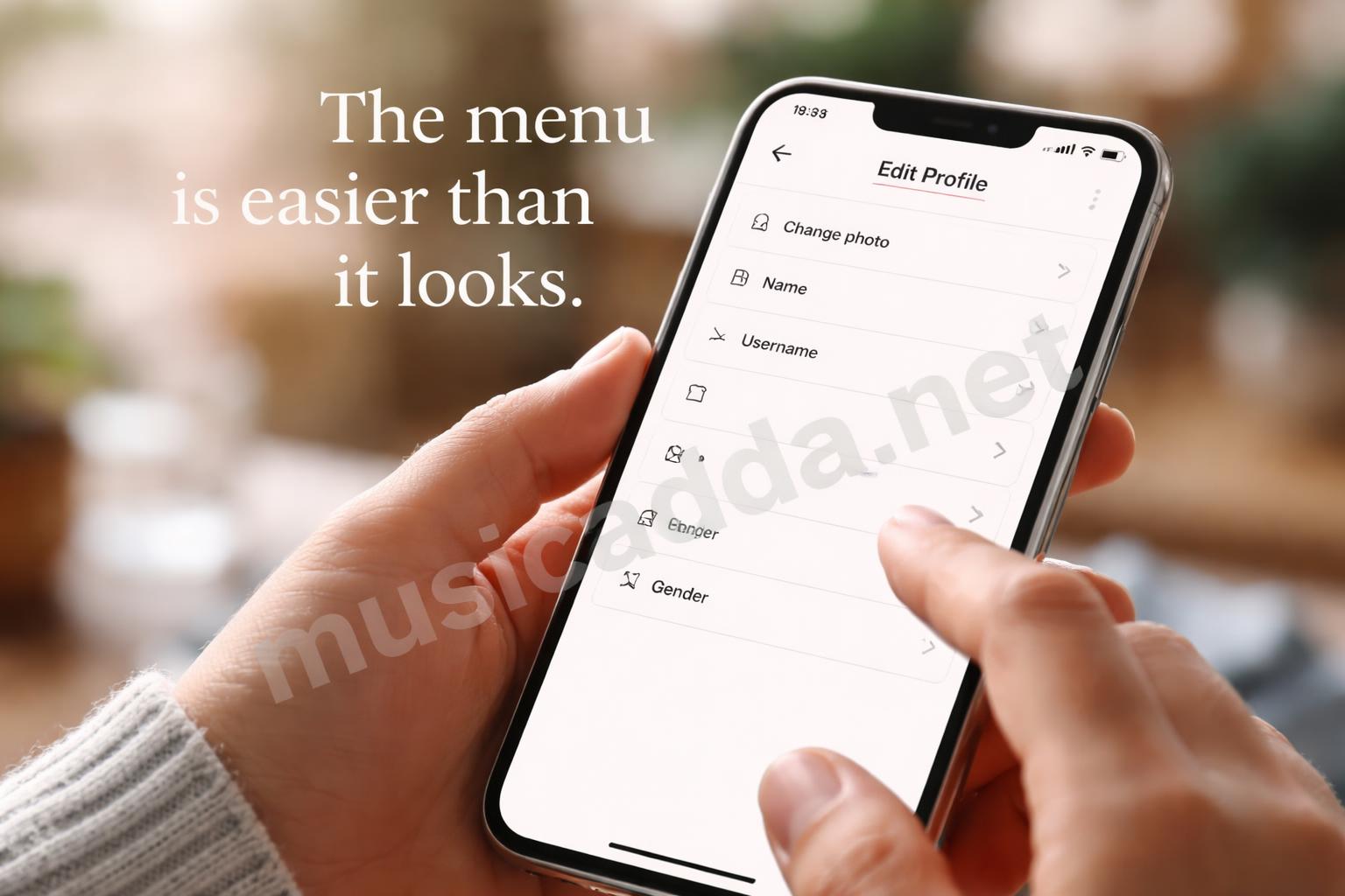
- Tap More or Edit Highlight.
- Choose Edit Cover.
- Pick a new image from your camera roll or from the Highlight story itself.
- Adjust the crop, then save.
That’s really it. The part most people miss is that the cover doesn’t have to come from a live Story anymore. You can use an existing image from your phone, which makes the process much easier.
One thing I learned the hard way: if your new cover is too busy, it can look fine in the edit screen and still feel cramped once it sits in the tiny highlight circle on your profile.
What actually changes when you edit the cover
The Highlight stays exactly where it is. Your stories remain grouped inside it, and your followers won’t lose access to anything already saved there.
What changes is only the thumbnail people see on your profile. That’s why this is such a useful fix. It’s a visual update, not a content reset.
If you want a cleaner walkthrough of the editing flow, this quick guide on changing an Instagram Highlight cover in seconds is a handy companion reference.
Before you tap save, check the cover image first
A lot of people rush this part, then wonder why the cover looks awkward on the profile grid. The highlight circle is small, so the cover image needs to be simple and centered.
I usually look for three things:
- A clear icon or symbol
- Enough empty space around the edges
- A color that still stands out in a tiny circle
If you use a photo instead of a graphic, try cropping tightly around the main object. Too much background usually gets lost anyway.
A small mistake that happens often
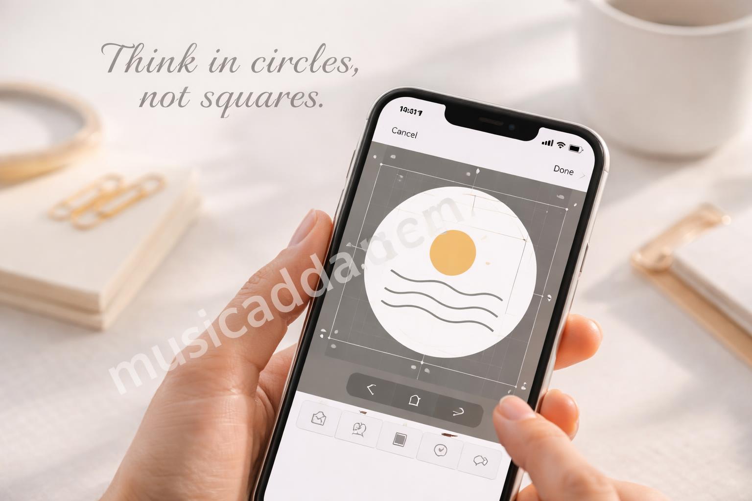
People often choose a cover that looks good as a square, but not as a circle. That mismatch is what makes the result feel slightly “off” even when the image itself is nice.
The fix is simple: think in circles, not squares. Center the main subject and leave breathing room.
How to replace the cover without touching the Highlight content
This is the part that makes people nervous, but it’s not complicated once you’ve done it once. Instagram separates the cover image from the story collection, so editing one doesn’t affect the other.
Here’s the safer way to do it:
- Open the Highlight.
- Tap Edit Highlight.
- Tap Edit Cover.
- Select the new image.
- Pinch and drag until it sits right.
- Confirm the change.
That final crop step matters more than people expect. If the cover shifts even a little, the icon can look cut off when it returns to your profile.
And yes, that’s normal. The small circle is unforgiving.

If your app layout looks slightly different
Instagram changes button names and placements from time to time. Sometimes it says Edit Highlight, sometimes the menu feels tucked away a bit more. The idea is the same, though.
If you don’t see the exact label you expected, look for the edit menu inside the Highlight itself. That’s usually where the cover option lives.
Making the cover look better, not just different
Changing the cover is one thing. Making it look intentional is another. I’ve seen plenty of Highlight covers that were technically correct but still looked random next to each other.
That usually happens when the profile has no shared visual style. The covers don’t need to match perfectly, but they should feel related.
A simple set of choices usually works best:
- Same background color
- Similar icon style
- Matching line thickness
- One repeated accent color
If you’re building covers from scratch, it helps to keep them simple. A tiny icon often works better than a detailed illustration because the profile view compresses everything so much.
For people who want a more polished look, these ideas for professionally designed Instagram Highlight covers are worth checking before you make your next set.

Why simple covers usually win
A busy cover might look impressive on your phone, but once it shrinks down, details disappear. That’s why the cleanest covers tend to look the most professional.
In my experience, the less I try to cram into the circle, the better the whole profile looks.
If you want to use a custom image from your camera roll
This is the easiest route when you’ve already designed something in Canva, saved a photo, or made a plain background with text-free artwork.
The steps are almost the same, but instead of pulling from an old Story, you choose the image from your device. That gives you more control over color, spacing, and crop.
A few things help here:
- Use a high-resolution image
- Avoid tiny details
- Keep the icon centered
- Test the crop before saving
Tip: save a version with extra space around the edges. That makes cropping much easier inside Instagram.
Common problems people run into
The process sounds easy, but a few annoying things show up often enough that they’re worth calling out.
1) The cover looks blurry
This usually happens when the original image is too small. Instagram compresses things, and a low-quality image can turn soft fast.
Use a larger file when you can. Even if the image looks fine on your phone, it may not hold up inside a tiny profile circle.
2) The wrong part gets cropped
This happens when the subject is too close to the edge. The circle crop cuts it off, and the cover stops looking balanced.
The easiest fix is to move the key object toward the center before saving.
3) The highlight disappears
This is the one people worry about most. If you’re only changing the cover, the Highlight should stay. If it doesn’t, you probably backed out of the wrong menu or deleted the Highlight by accident.
That’s why I always recommend going slowly the first time. Once you know where the cover edit lives, it gets much easier.
A simple workflow that saves time
If you change highlight covers often, don’t do everything inside Instagram from scratch each time. Make a small folder on your phone with ready-to-use cover images.
That way, when you want to change one, the image is already there. No hunting through old screenshots. No random scrolling through your camera roll.
Here’s a workflow that keeps things tidy:
- Create or save covers in one folder.
- Name them by topic if you can.
- Keep a backup copy.
- Update only the cover when needed.
- Recheck the profile view after saving.
This small habit saves more time than it sounds like it should. I only realized that after a few annoying edits where I kept re-searching for the same file.
A practical note on matching your profile
If your profile has a brand look, even a basic cover change can make the page feel more organized. That matters whether you’re running a personal account, a creator page, or a small business page.
It’s not about being fancy. It’s about making the page feel like someone meant to put it together.
What to do if you want a cover that matches verification or brand trust
A clean Highlight cover won’t get you verified on its own, but a neat profile does help your account feel more credible. That matters if you’re trying to look serious and consistent.
Instagram’s verification process has its own rules and review standards, so don’t confuse profile polish with the badge itself. If that’s on your mind too, this straightforward guide to getting verified on Instagram breaks down the bigger picture without making it more complicated than it needs to be.
That said, a tidy profile can still support the overall impression. A clean cover, clear bio, and consistent stories all help the page feel intentional.
When to change the cover and when to leave it alone
Not every Highlight needs a new cover. Sometimes the old one is fine, and changing it just because you’re bored can create more work than it’s worth.
I usually change a cover when:
- the topic of the Highlight has changed
- the old cover looks outdated
- the profile style has shifted
- the current cover is too hard to read
- I want the row of Highlights to feel more unified
I leave it alone when the cover still works and the rest of the page already feels consistent. There’s no rule that says every Highlight has to match perfectly.
A quick example of a cleaner profile reset
Say you have Highlights for travel, food, and behind-the-scenes clips. If each cover uses a different style, the row can feel scattered. But if all three share the same background shade and icon style, the whole profile looks calmer right away.
That’s one of those small changes people notice without always knowing why. It doesn’t scream for attention. It just makes the page easier to scan.
Troubleshooting if Instagram won’t save the new cover
Sometimes the app just acts stubborn. The cover appears to change, then reverts, or the save button doesn’t seem to stick.
When that happens, I’d check these first:
- Update the app
- Close and reopen Instagram
- Try a different image
- Make sure the image file isn’t corrupted
- Log out and back in if needed
That sounds basic, but it usually fixes the weird little issues. App glitches tend to be annoyingly ordinary.
One thing to remember
If the edit feels broken, it’s usually not your cover design. It’s often the app or the file format.
Final thoughts
Changing an Instagram Highlight cover without deleting the Highlight is one of those small edits that feels minor until you see the difference on your profile. Once you know where the setting is, it takes only a minute or two, and the result can make the whole page feel more deliberate.
The trick is to keep the cover simple, centered, and easy to read at a tiny size. That’s what makes the change actually look good instead of just different.
And honestly, that’s the part I keep coming back to: small profile fixes matter more than they seem.
Save This Guide on Pinterest
Save this image to Pinterest so you can easily return to this guide later.