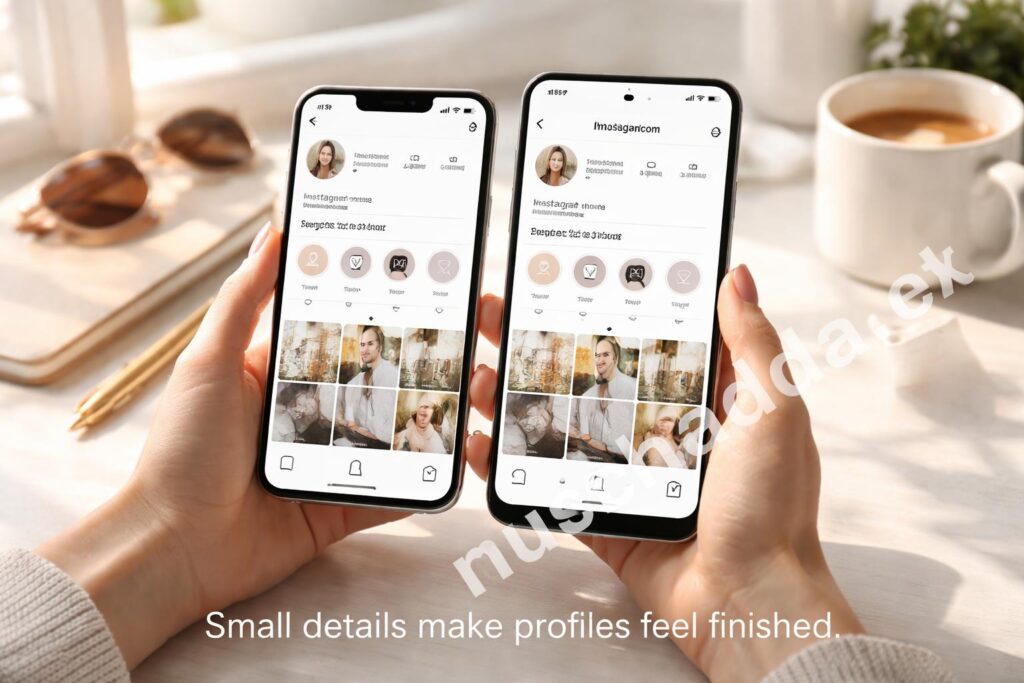
Instagram Highlight covers look small, but they change how a profile feels right away. If your covers are mismatched or missing, your Highlights can look messy fast, and that usually makes the whole profile feel a little less intentional.
The good news is that adding or changing Instagram Highlight covers on iPhone and Android is simple once you know where Instagram hides the option. In this article, I’ll walk through the quick steps, a cleaner way to make covers look consistent, and a few mistakes I keep seeing people make when they try to do it in a hurry.
Why Instagram Highlight Covers Matter More Than People Think
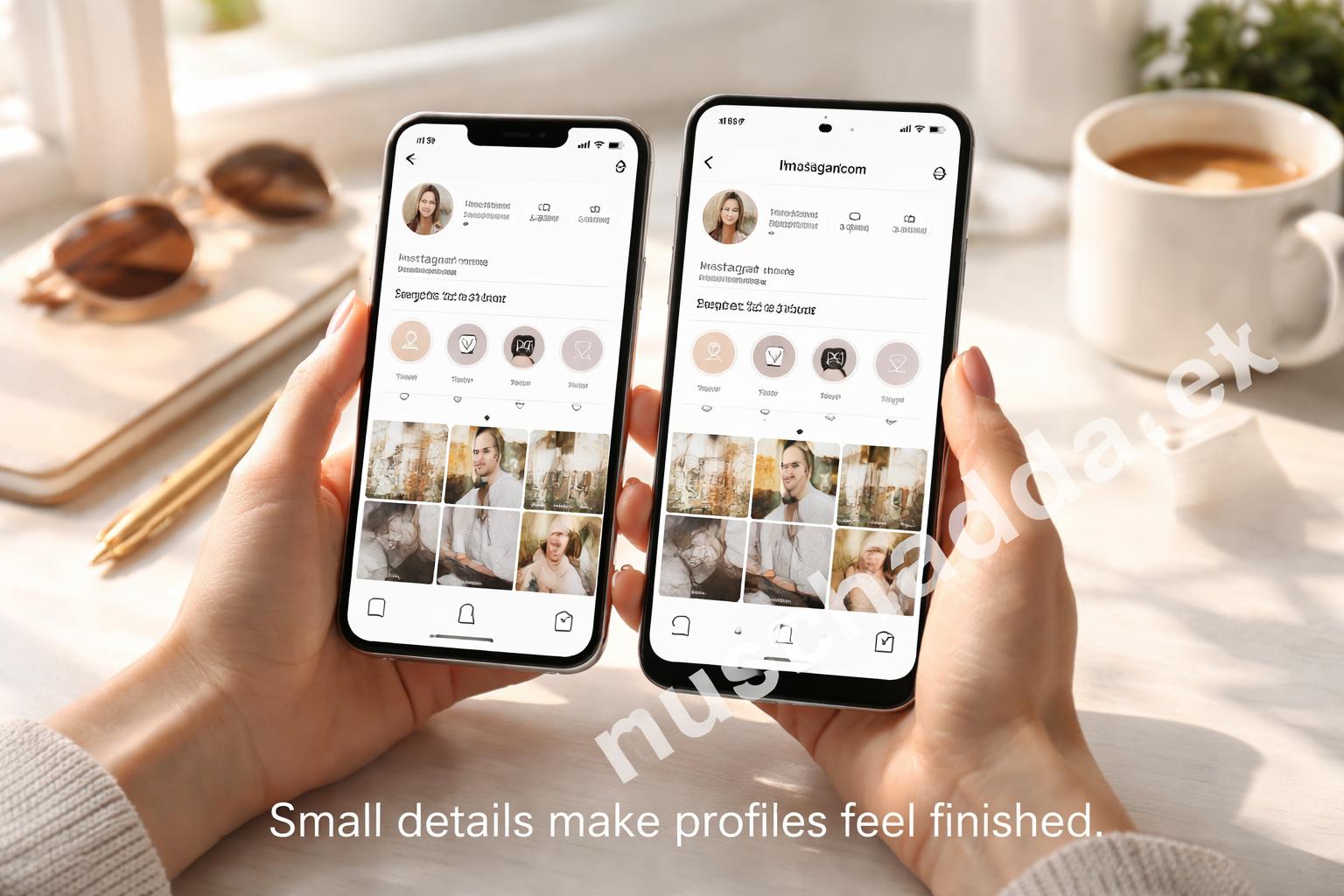
I’ve noticed that people often treat Highlight covers like decoration, but they do more than that. They help organize your profile at a glance, which matters if someone is deciding whether to follow you.
If all your circles look random, the page can feel rushed. If the covers match, your profile immediately feels more polished, even if the content itself hasn’t changed.
That’s why Instagram Highlight covers are less about style and more about making your profile easier to read. On a small phone screen, that visual order does a lot of work.
The small detail that changes the whole profile
Most people don’t realize this, but the cover is often the first thing a visitor notices after your bio. If the icons are clean and easy to understand, your Highlights feel useful instead of cluttered.
And if you’re trying to build a sharper profile, that tiny detail helps more than people expect. I’ve seen profiles feel “finished” simply because the covers matched.
How to Add Instagram Highlight Covers on iPhone and Android
The process is basically the same on both phones. The app layout may shift a little depending on updates, but the steps stay close enough that you won’t need to relearn everything.
Here’s the simplest way to do it:
- Open Instagram and go to your profile.
- Tap the Highlight you want to edit.
- Tap More or Edit Highlight.
- Choose Edit Cover.
- Pick an image from your gallery or use one from the Highlight itself.
- Adjust the crop so the icon sits where you want it.
- Tap Done and save the changes.
That’s the basic process for adding Instagram Highlight covers on iPhone and Android. It usually takes less than a minute once you’ve done it once or twice.
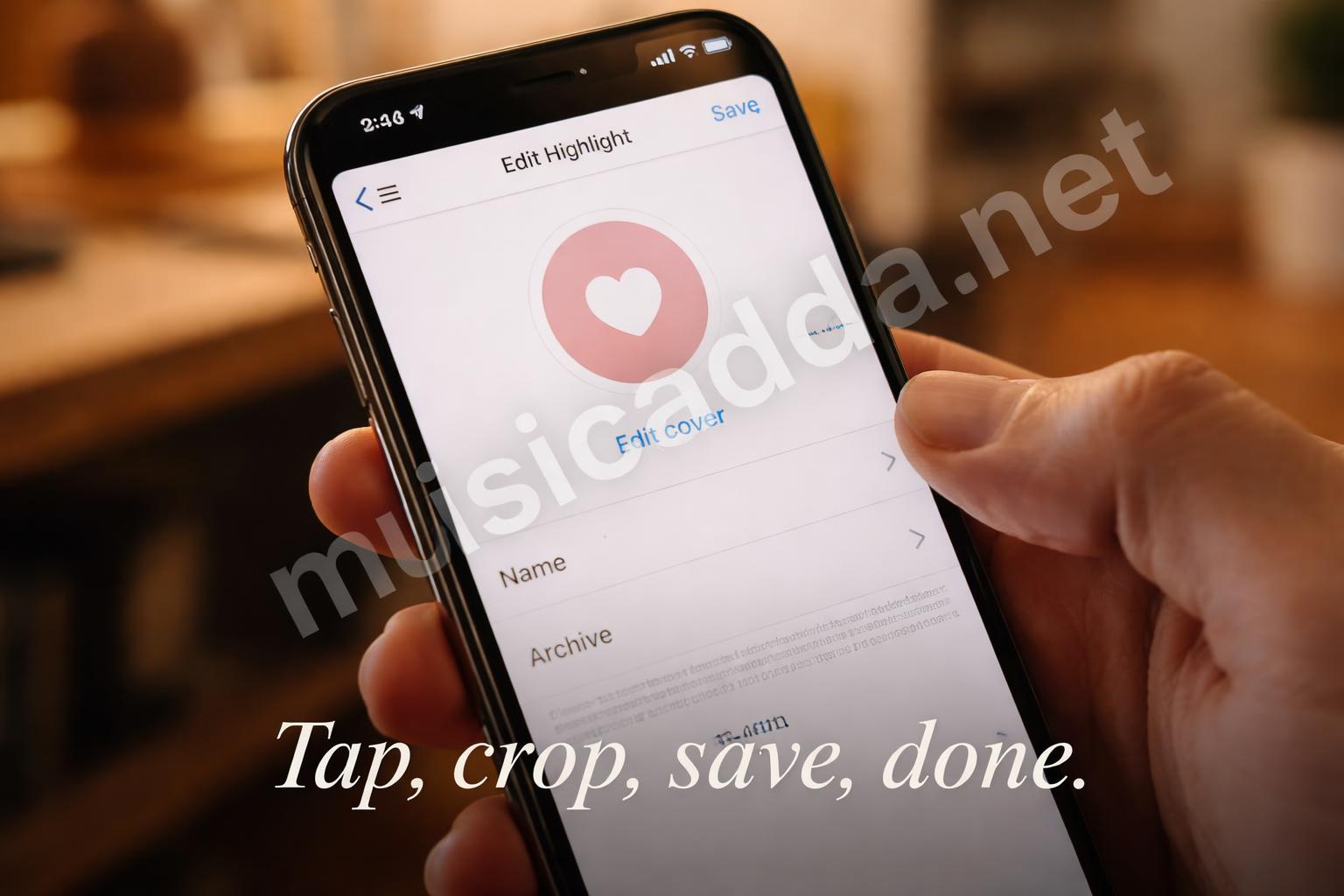
One thing I learned early is that the crop area can be a little annoying. The cover looks centered on-screen, but if your icon is too close to the edge, it can end up looking off once it’s saved.
The Fastest Way to Change a Highlight Cover
If you already have the image ready, changing a cover is quicker than adding a new Highlight.
On iPhone
Go to your profile, open the Highlight, and tap Edit Highlight. Then switch to Edit Cover and choose the photo you want.
iPhone users usually get a smoother crop screen, but I still recommend zooming out a little before saving. If you crop too tightly, the image can look cramped inside the circle.
On Android
Open the Highlight, tap the menu, and look for the edit option. Instagram sometimes labels buttons slightly differently on Android, but the path is the same.
The only real difference I’ve noticed is that Android layouts can feel a bit more spread out, so the cover selection screen may look slightly different depending on your device. That’s normal.
Quick tip: If your cover is already a square image, it’s easier to position than a rectangular screenshot or a busy photo.
What to Use for a Clean Highlight Cover
You don’t need anything fancy. In fact, simpler usually works better.
A good cover is usually one of these:
- A plain background with one icon
- A minimal symbol that matches your brand
- A soft color that fits your profile grid
- A cropped photo that still reads clearly inside a circle
If you’re making covers from scratch, the goal is not to make them busy. The goal is to make them easy to understand in one glance.
I’ve seen a lot of people overdo it here. They add too many colors, tiny details, or text that gets lost once the cover is shrunk down. The result looks great in a design app and disappointing on Instagram.
Keep the center simple
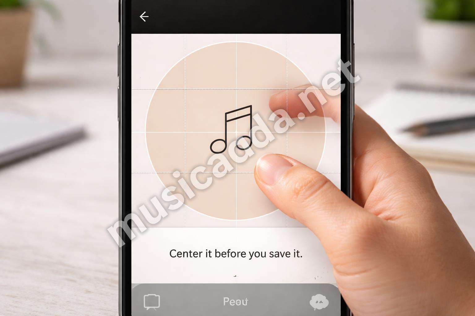
Instagram uses a circular crop, so the middle matters most. Anything near the edges can disappear, which is why simple icons and centered designs usually look best.
A clean center is more important than a fancy design. That’s the part people actually see.
If you want more ideas for making covers look more polished, this guide on how to make Instagram Highlight covers that look professionally designed is worth a look. It helps if you want your profile to feel more consistent instead of just technically “done.”
Making Covers That Fit Your Profile Style
This is where people usually get stuck. They know how to upload the cover, but they’re not sure what should go on it.
A good rule is to match the cover style to the mood of your profile.
- Personal account: soft colors, simple icons, friendly photos
- Business account: clean symbols, bold contrast, branded colors
- Creator profile: consistent themes for each Highlight category
- Lifestyle page: lighter tones and images that feel relaxed
If your feed is already colorful, your covers don’t need to fight it. If your feed is minimal, don’t add noisy covers that break the pattern.
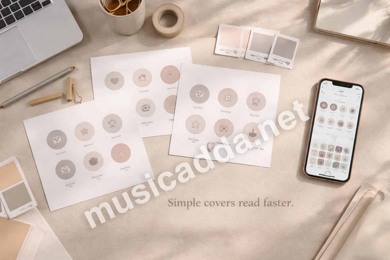
I usually tell people to think about the profile as a row of tiny signs. Each cover should hint at what’s inside. That makes the page easier to scan, and honestly, it feels more trustworthy too.
Common Mistakes When Adding Highlight Covers
There are a few mistakes that keep showing up, and they’re easy to fix once you notice them.
1. Using a cover that’s too detailed
A detailed image may look fine in your camera roll, but inside a Highlight circle it often turns into clutter.
2. Forgetting the crop
This one gets people all the time. The icon looks centered in the editor, then shifts slightly after saving. That’s why leaving some breathing room around the edges helps.
3. Mixing too many styles
One cover in pastel, one in neon, one in black-and-white, one with text, one without text — that mix can make the whole row look accidental.
4. Using low-quality screenshots
Screenshots are usually fine for quick personal use, but they often look soft or oddly framed once uploaded. If you care about the profile look, use a clean image file instead.
Warning: If the cover looks blurry before you save it, it will usually look worse after Instagram compresses it.
How to Add Instagram Highlight Covers From Your Camera Roll
This is the part most people want when they say they want to add Instagram Highlight covers on iPhone and Android. They already have a design saved, and they just need to get it into the Highlight.
Here’s the easiest way:
- Save your cover image to your phone.
- Open the Highlight on Instagram.
- Tap Edit Highlight.
- Choose Edit Cover.
- Tap the gallery option.
- Select the image from your camera roll.
- Adjust placement and save.
If the image was made for social media, it should already be close to the right size. If not, crop it before uploading so you’re not fighting the app’s built-in editor.

Best image size to aim for
Instagram changes layout details sometimes, so I won’t pretend the app is perfectly consistent. But a square image usually works best for Highlight covers because the app crops it into a circle.
If you want your design to stay clean, keep the important part centered and leave space around it. That helps no matter what phone you’re using.
If You Want a More Polished Look, Start With the Design First
A lot of people try to fix the profile by changing the cover last. That works, but it’s not the easiest route.
It usually helps to make the cover first, then upload it. That way you’re not forcing the crop to solve a design problem.
Some of the better-looking Highlight sets I’ve seen use the same kind of background across all covers, then vary only the icon. That small consistency makes a big difference.
If you’re still building the look of your profile, the article on how to change a Highlight cover on Instagram in seconds is a good companion piece. It’s especially useful if you just need the quick edit path and don’t want to dig through menus.
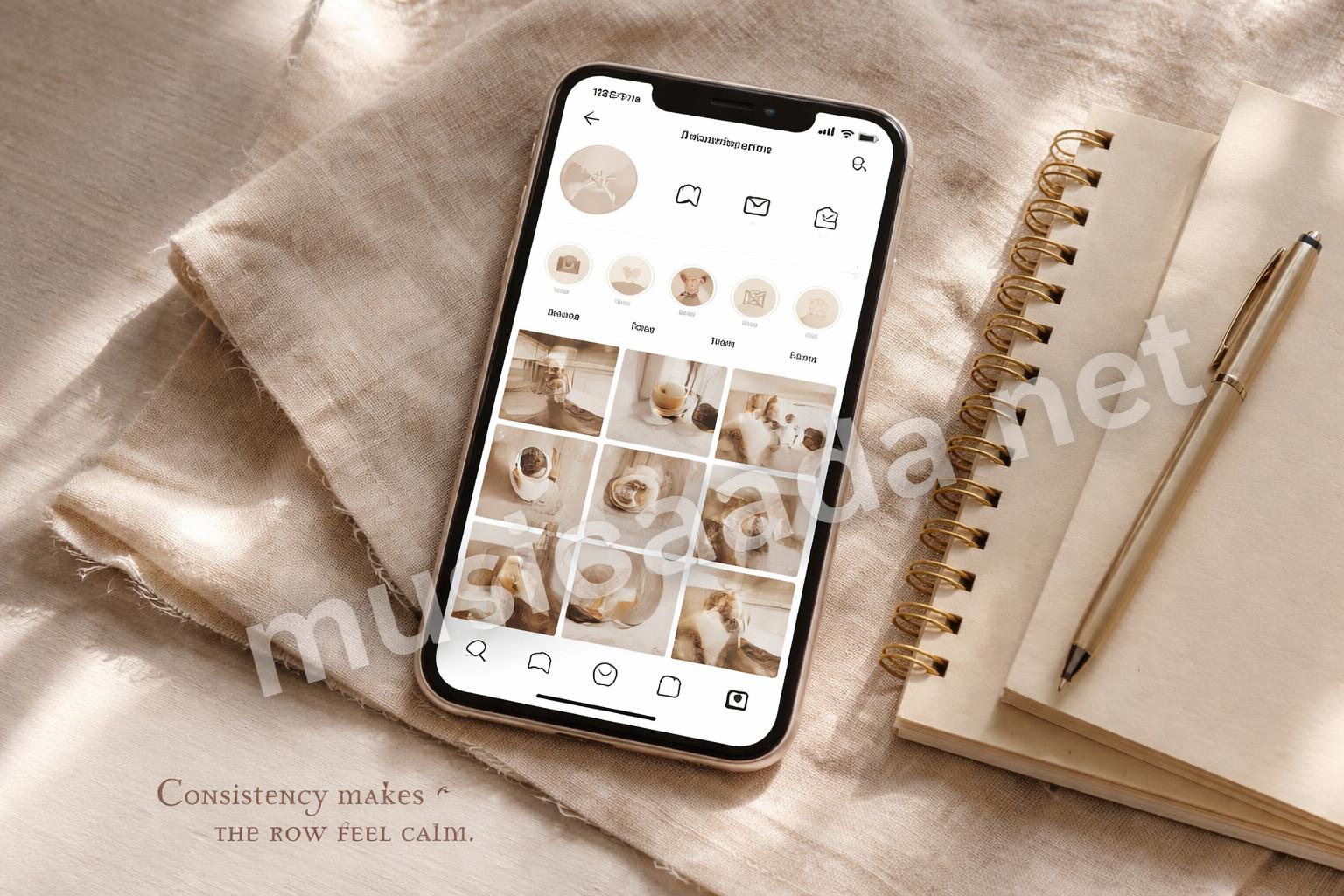
A Simple Way to Keep Everything Consistent
You don’t need to be a designer to make your Highlights look coordinated.
Try this:
- Use one background color family
- Keep icons the same style
- Stick to two or three font styles if you use text
- Leave enough empty space in each design
- Save all covers in one folder so you can reuse them later
That last part sounds small, but it saves time. I can’t count how many times I’ve seen people make a nice cover set, then lose half of it in their phone gallery.
A tiny system goes a long way here.
What to Do If the Cover Won’t Save Correctly
Sometimes Instagram acts a little weird. The cover may not update right away, or it may seem to jump back to an old image.
Try these fixes:
- Close and reopen the app
- Check that you tapped Save or Done
- Make sure the image file is actually on your phone
- Update Instagram if the app is outdated
- Log out and back in if the change still doesn’t appear
Most of the time, it’s not a real problem. It’s just the app being delayed or your network being slow.
Practical takeaway: If the cover looks right in the editor, wait a minute before assuming it failed.
When to Change the Cover and When to Leave It Alone
I think people sometimes change covers too often. That can make the profile feel unstable.
Change them when:
- Your branding changes
- A Highlight topic changes
- You want a cleaner look
- You’re cleaning up old content
Leave them alone when:
- The current set already feels consistent
- You’re changing them just because you’re bored
- The icons still match the content inside
That balance matters. A clean profile is nice, but constant tweaks can make it look unfinished.
If you’re also thinking about profile credibility, not just appearance, this explanation of how to get verified on Instagram without overcomplicating it may be useful. Verification and visual polish aren’t the same thing, but they both shape how your profile feels to a visitor.

A Quick Checklist Before You Save
Before you tap done, I usually suggest checking these few things:
- Is the important part centered?
- Does the image still read clearly when it’s tiny?
- Does it match the other covers?
- Is the background too busy?
- Does it look good against your profile colors?
That last check matters more than people think. A cover can look great on white but awkward on a profile with darker tones.
Final Thought
The easiest way to add Instagram Highlight covers on iPhone and Android is to keep the process simple and the design even simpler. That’s usually what makes them work.
I still think the best covers are the ones people barely notice at first, because they just make the whole profile feel easier to use. And once you get that part right, the rest of the page tends to fall into place.
Save This Guide on Pinterest
Save this image to Pinterest so you can easily return to this guide later.